Mkem.
Branding and Website

Branding | Visual Design | Website Design | Typography

Mkem is a consulting company specializing in the event industry. They focus on modernizing existing events and helping them transition to an ever-increasing digital world.

As the lead designer my reponsibility was to firstly to update the brand (both logo and overall style), and then to use that to build them a new website. Since they market themselves as helping legacy events modernize; it’s essential that they present a professional, trendy, and up to date website.

My Role & Team

Design Lead collaborating closely with the founder and team.

Target Audience

Event companies looking to refresh their brand, or more recently in-person events looking to create a hybrid or online event.

How It Was Made

Adobe Illustrator, Adobe Photoshop, Local by Flywheel, WordPress.

The Goals We Want to Achieve

Based on our industry comeptition research there wasn’t a huge amount of problems with the brand so we decided to focus on goals. The most important metric from the founder was increasing their digital footprint and to freshen up the style.

  • πŸ’» Digital First. Had to look great on all devices.
  • 🏚 Modern. When convincing clients of the benefit of a hybrid or online event, its important to showcase a great online presence yourself.
  • πŸ“’ Original. We wanted something that would stand out from the crowd.
  • πŸ“Š Corporate. Had to present a very professional look to appear to large companies and conglomerates.
  • ⏱ Quick. Due to Covid-19 we were under tight timeline to get it live ASAP so that we could stay ahead of the curve for hybrid/online events.

The Baseline

The original logo was well liked, and been in use for several years without issue. After discussing with the founder of Mkem he made it clear that he likes the blue colour theme and keeping the lettermark of the “M”, so it was a great starting point. We knew we wanted to keep it lively, fun, professional, and striking.

The Brand

I decided to start with picking the main typeface first. After going through many options I narrowed my search down to 3 favourites. Two “mild” options and one “wild” one. I met with the founder and he was actually excited for all of them, but I could kind of tell which direction he was leading. After reviewing the style with other company stakeholders it was decided that the middle one was a bit too edgey/abstract for some of the corporate clients they target. With that in mind I prefered and presented the left-most one as a very clean and modern typeface to represent the brand.
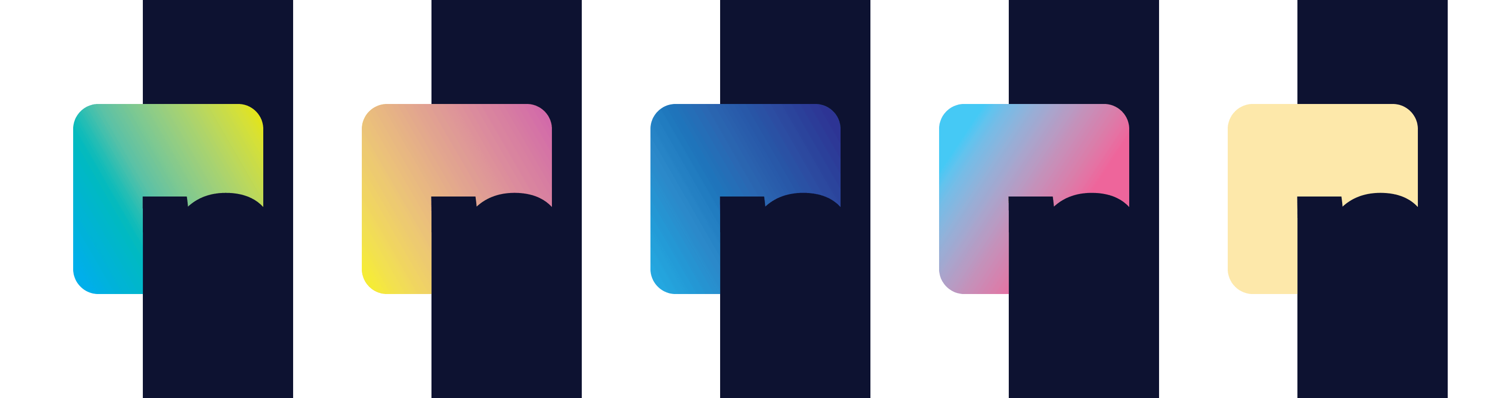
The Icon

With the typeface mostly decided, it was on to the creating the icon that would pair with it. I wanted to keep it clean and simple since it was going to be used in a lot of merchandise and small/large formats.

While we had mainly decided on the typeface to use, I continued with the other icons as an exercise and for contrasting with the main one in presentations. After showing him the icons it was pretty unanimous that we both preferred the look of the one on the left and we were all happy with the initial direction we took.
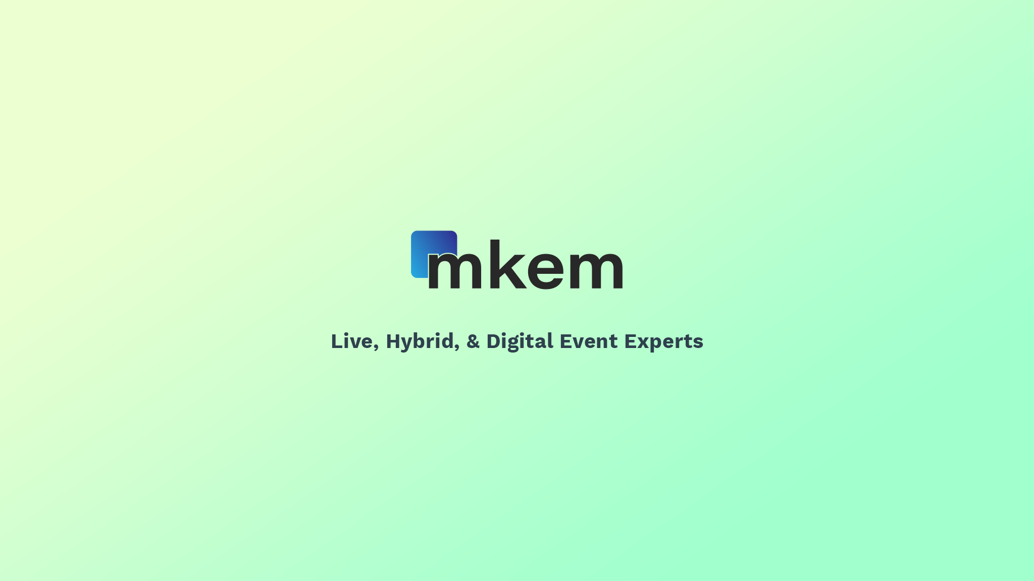
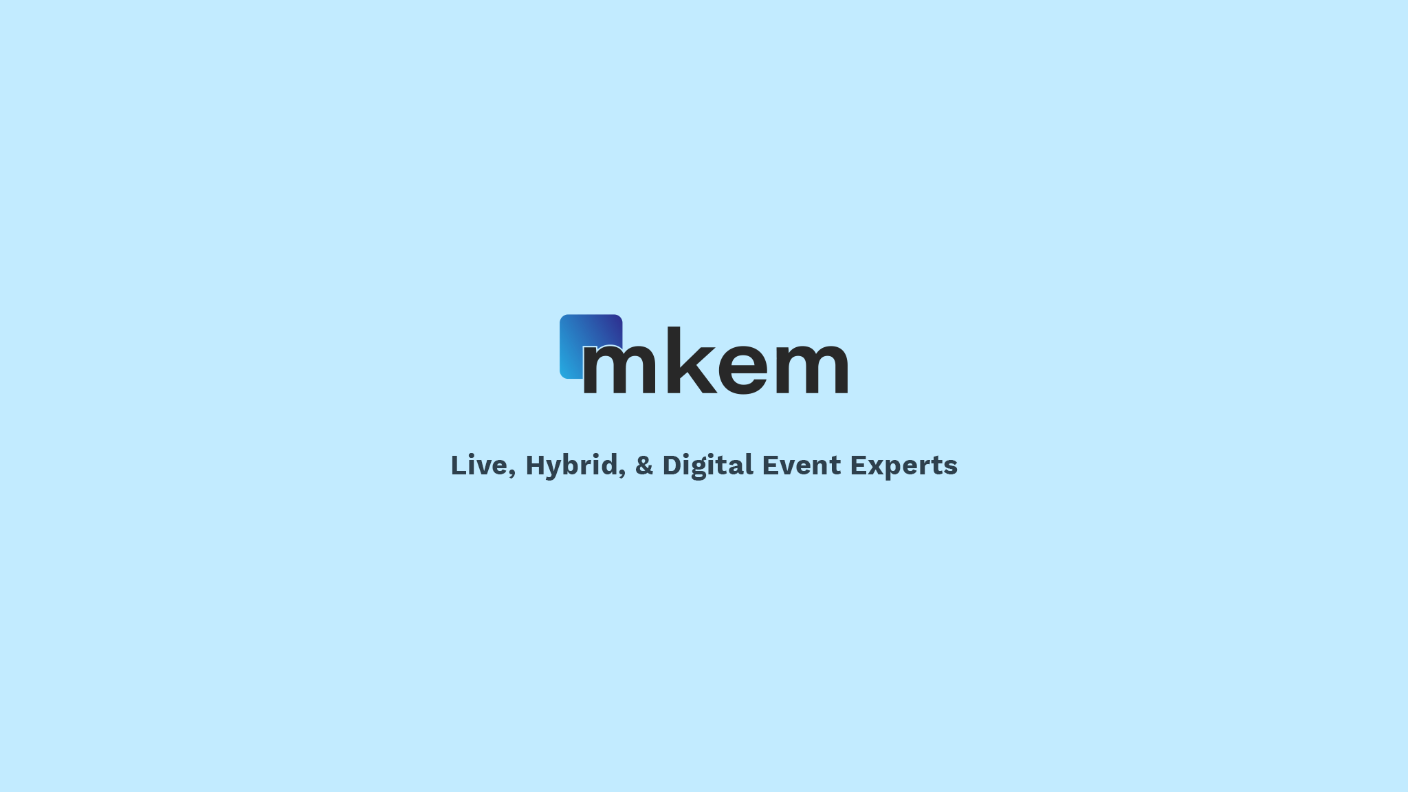
Colour Theme

Although the colour theme above is what we ended up going with, we also tried a variety of gradients to get the look we were going for. We wanted to convey fun, playful, stable, etc., and while the blues were by far the favourite I also wanted to present some other possibilities. It was also essential that it would look good on both dark and light backgrounds, since I wanted to keep the two variations of the logo as consistent as possible.

The Logo

With the font, icon, and colour theme decided the last thing to do was put it all together. I incorporated the icon into the main logo to keep a cohesive brand image whenever it was used. With the founder and stakeholders happy with the logo, it was time to move on to the website.
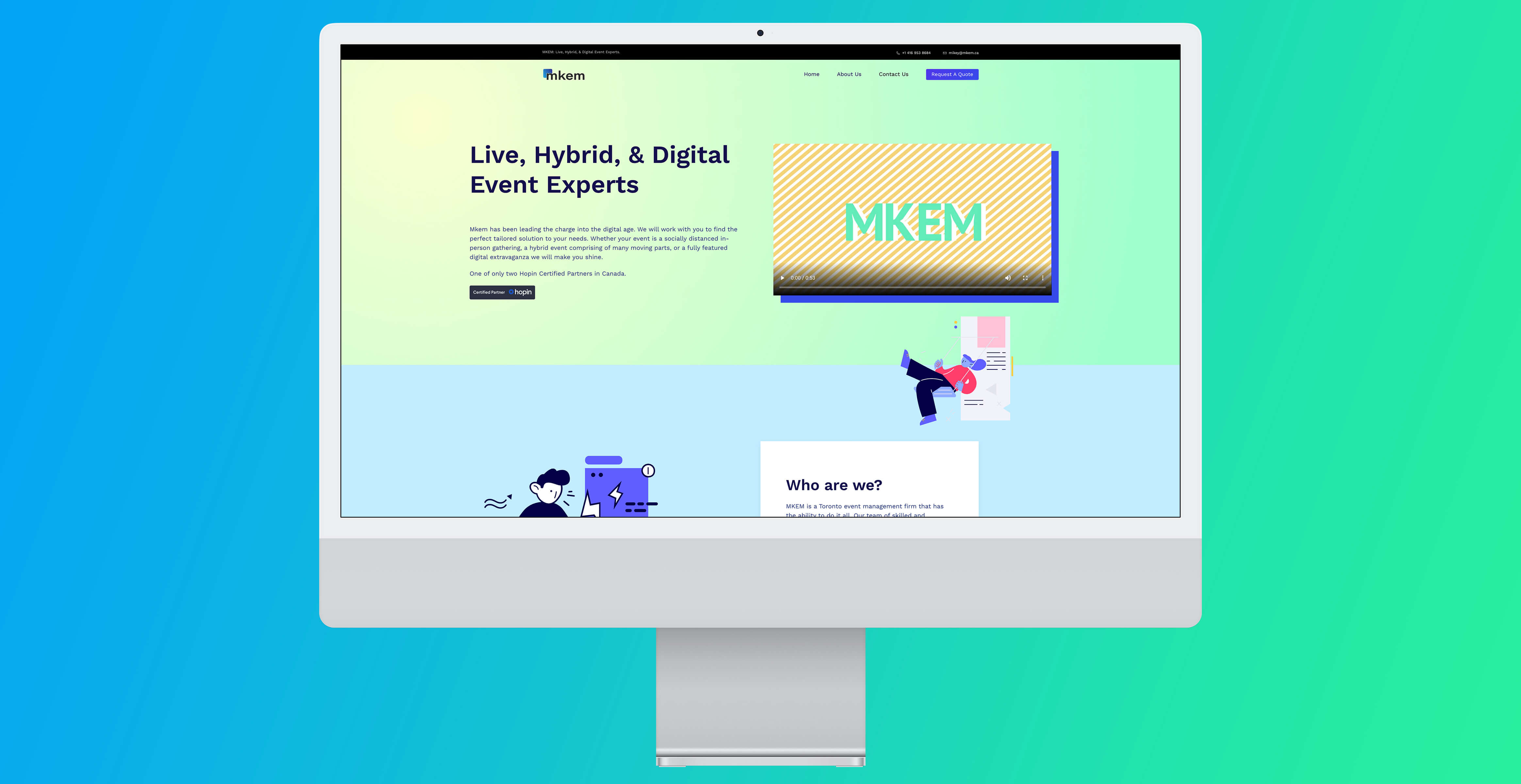
Some Style

With the logo happily completed and approve we moved on to building some of style elements we would use as building blocks for the website.

I wanted to show a modern, playful, and friendly approach. To accomplish this I combined vibrant gradients using bright colours, and stylish illustrations that matched the brand look I was going for.

The Website

Now that we had our foundation we were ready to get going on the website. With the extremely tight timelines we knew we had to rapidly prototype. To do this we first decided on the layout of the pages, a rough draft of the content on each page, and the main messaging we wanted to get across.

With that in mind i researched the competition and other service companies to come up with a plan, and presented the following as our initial rough draft of the pages:

  • 🏑 Homepage
    Feature a strong message at the top, some basic information about the company, highlight a few case studies and clients, then contact information.
  • πŸ‘©β€πŸ’» About Us
    Mainly to showcase a “tldr” version of the history of the company and their current staff members. Also where we would place job postings.
  • πŸ“² Contact Us
    A place where people who just want to know how to contact or find mkem can head towards. Keep it simple and to the point.
  • 🚨 Call to Action
    At this point we were unsure if this should just be a button that goes direct to email, or have a call to action page, but the premise is the same: An attention grabbing link that would function similar to the contact us page but with the goal of grabbing specific information.

Building and Deploying

When deciding how and where to setup and host their website I took a couple major points into consideration: it was going to be a relatively low traffic site, it needed to be built and deployed ASAP, and there was going to infrequent updates. We also wanted to keep costs low without sacrificing performance, and because of the infrequent updates we did not want to worry about a WordPress vulnerability exposing the site.

I decided to go with a local WordPress install (using Local by Flywheel) that I would then deploy as a static site to Netlify. This has a huge advantage of not having to worry about any vulnerability in WordPress (since it was being deployed as static HTML/CSS/JS), and let me make use of WordPress to speed up development. Netlify is extremely quick with a fast CDN and deploys take less than a minute. All of it has the bonus of costing exactly $0 a month in hosting. This kind of deployment wouldn’t have worked if the site needed frequent updates by other people (ie. if they had a blog), but in this situation it made sense. All this is backed up both locally and on a cloud provider, so very minimal risk of data loss.

The End Result

We kept the fun/professional look throughout the site and made frequent use of colourful and vibrant backgrounds. The vibrant colours helped differentiate us from the competition and stand out since most in the industry feature a more subdued palette. We featured several case studies as that is important to many prospective clients and helps to reinforce the benefits that Mkem offers.

Performance and Success

The main measure of success used was a combination of anecdotal client feedback, and and website metrics provided via Google Analytics comparing before and after the revamped website was launched.

For the anecdotal aspect we interviewed Mkem’s founder, employees, and key stakeholders. We also heard feedback from their main clients (current and previous) to gauge their thoughts on the website and logo, particularly against the competition. The overall feedback was extremely positive.

“Avery turns the visions and dreams inside my head into reality, for both my website and all my printed materials. He’s my preferred designer.”
Michael Singer, Founder, Mkem

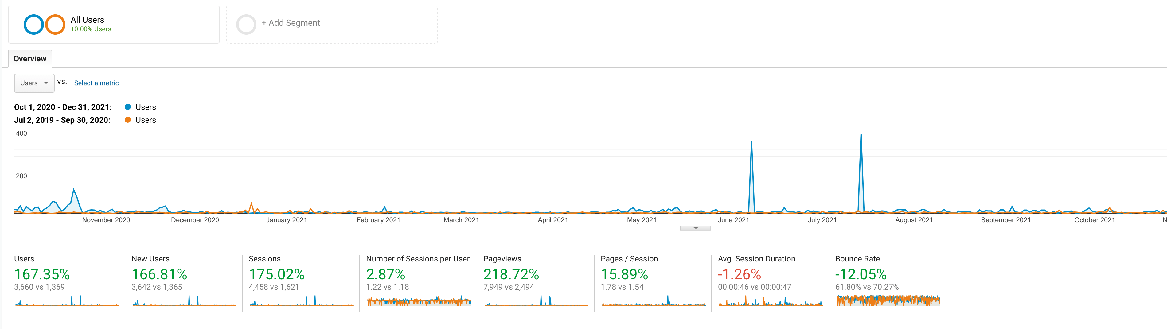
Overall Site Performance

We compared the overall statistics of the site before and after it was launched to judge the success. Other than the Avg. Session Duration dropping by 1 second you can see its a hugely more popular and more sticky site.

The main metrics I looked at was the number pages per session and the bounce rate. Users viewed more of the pages and were significantly less likely to leave the site after only seeing the front page. These stats are particularly important because they measure what the user does after they arrive.

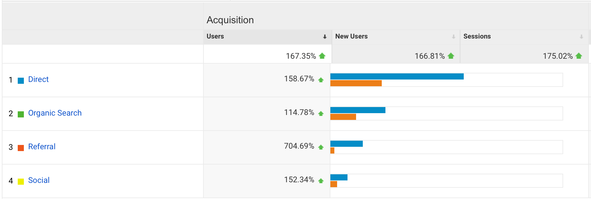
User Acquisition Performance

Arguably the most important metric for a website that doesn’t directly sell products on their site is the user acquisition metrics. By comparing the site pre/post launch by the same amount of time we can see that the popularity has grown significantly. The easiest metric to measure that a site redesign would influence is the organic search results, showing that the new site had a significantly positive increase in rankings.

While it’s possible for me to take some credit for the overall rise in popularly, it is also important to mention that business grew and became more successful during the same timeframe, which significantly contributed to the increase in user acquisition.

Β© Avery Levitt. All rights reserved.