Passkey
By far the biggest player in the space and our main rival to the large clients. They have a visually unfriendly yet powerful system, and excellent client retention.
OnPeak
OnPeak is another major player in the arena. They handle a large amount of bookings and have a nicer user experience than Passkey.
Meeting Max
Meeting Max was the smallest of the three and a limited feature set. They allow more customization which makes their events look more unique.
Every Hotel Booking Site!
Our biggest competition we found was event planners who essentially found the process too daunting and just would let attendees find hotel reservations themselves.
So from an attendees point of view we had to not only be better than our industry competition, we had to also be better than the booking industry as a whole!
So from an attendees point of view we had to not only be better than our industry competition, we had to also be better than the booking industry as a whole!
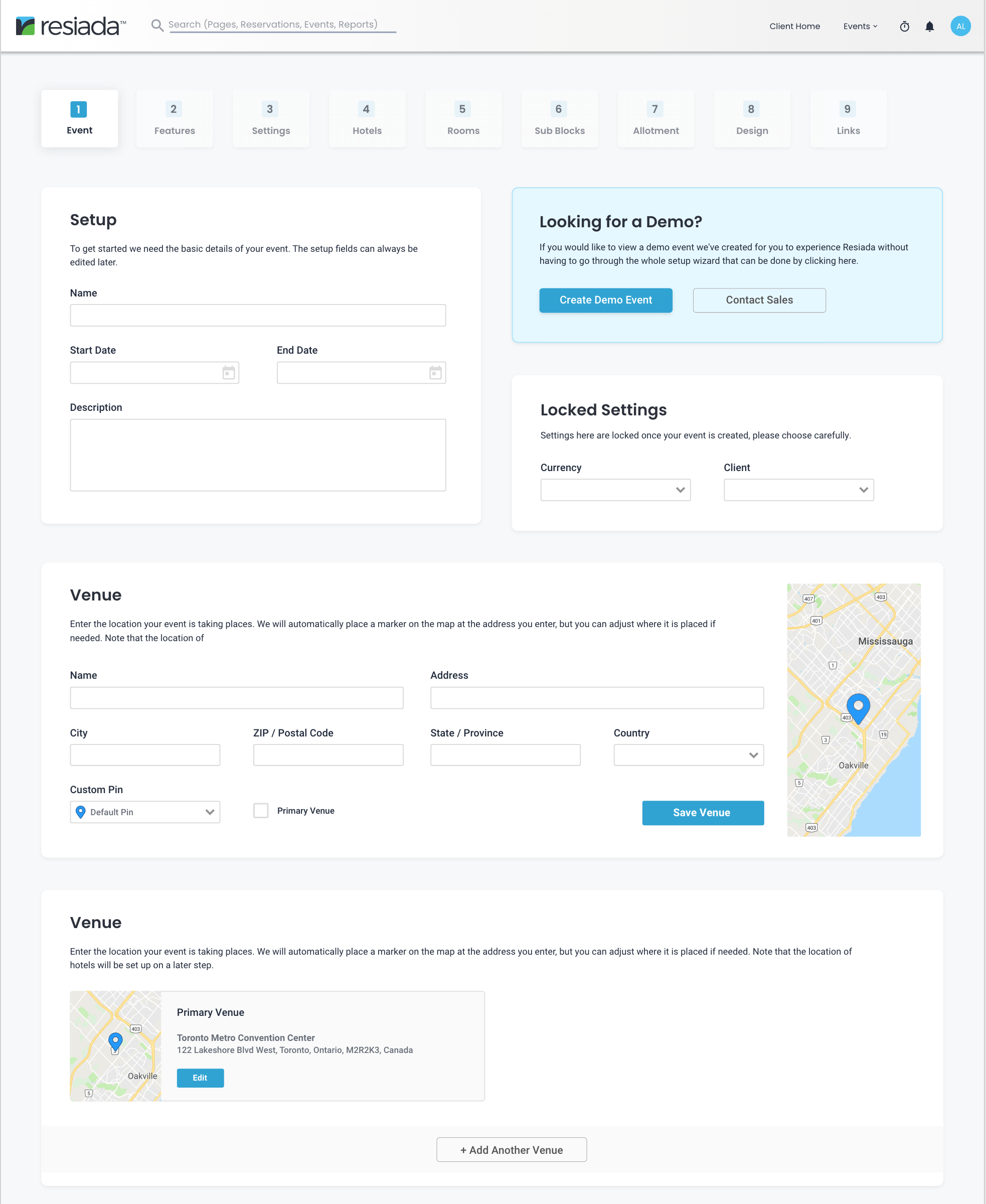
The “Wizard” 🪄
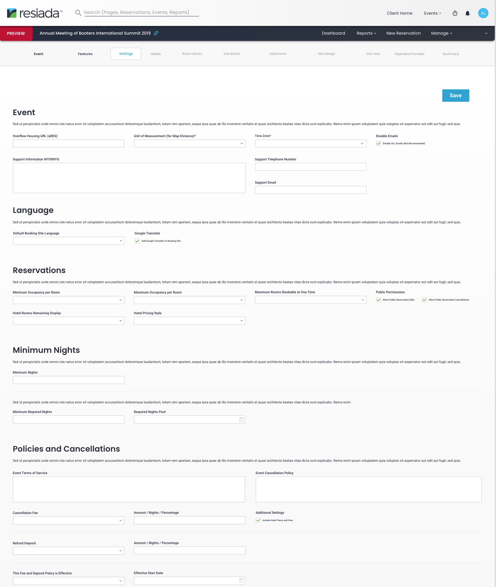
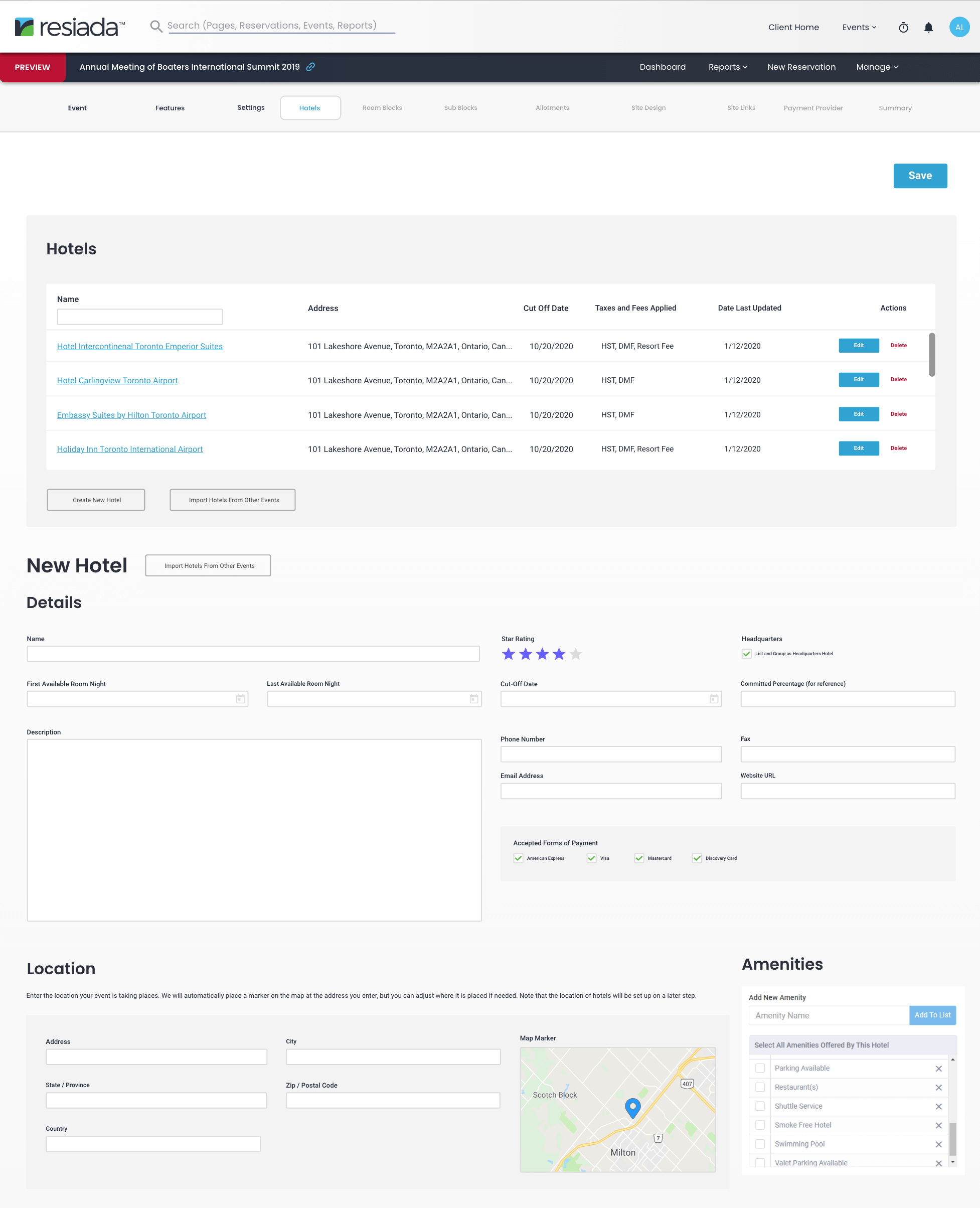
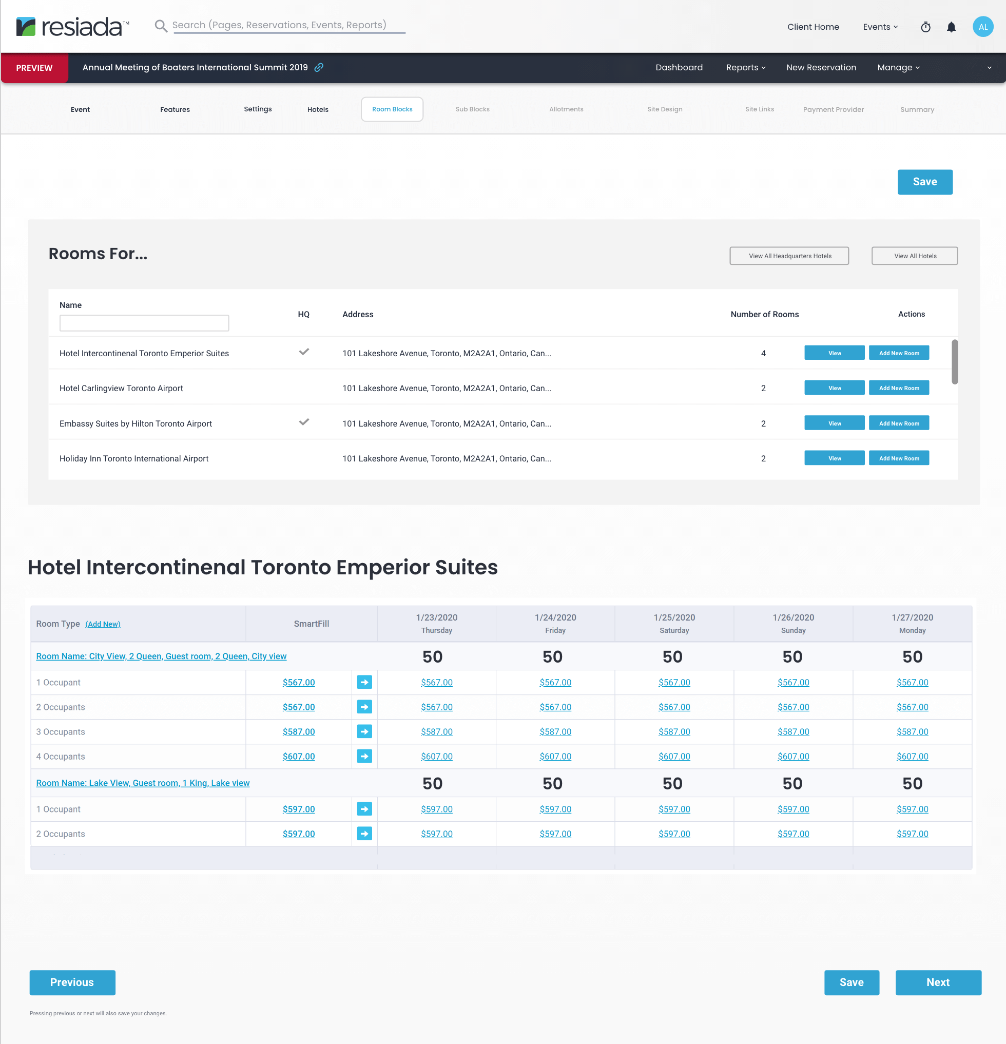
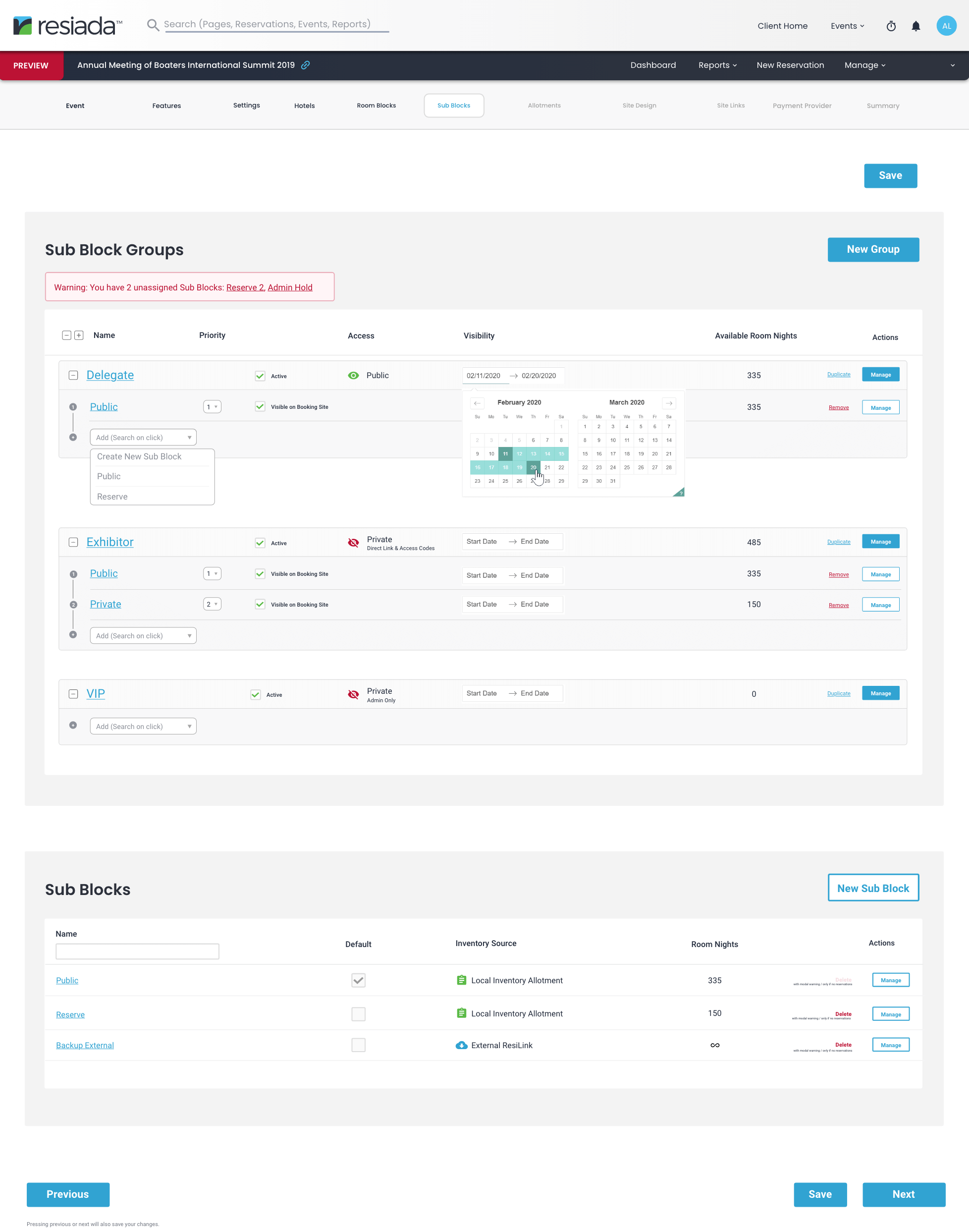
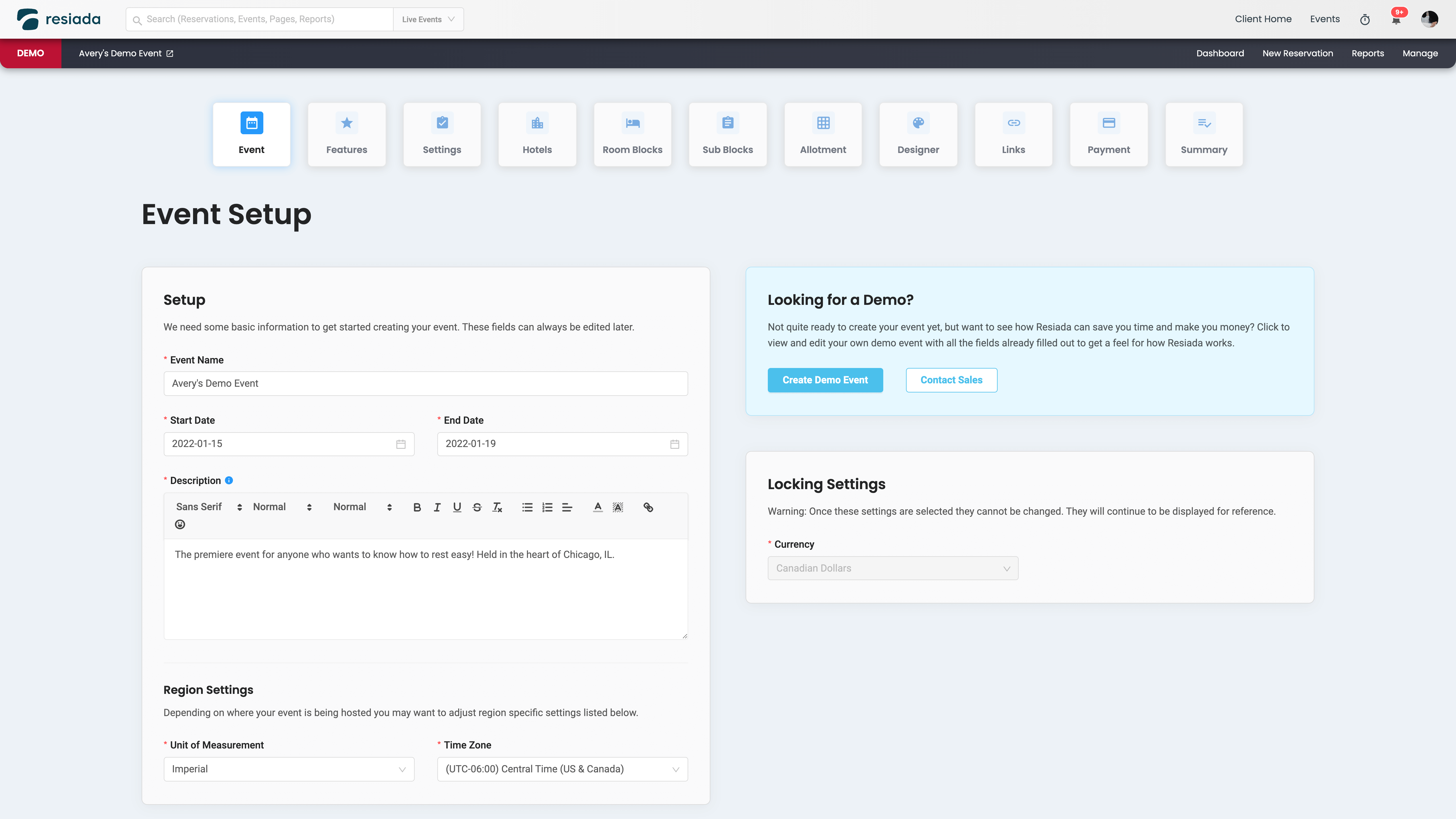
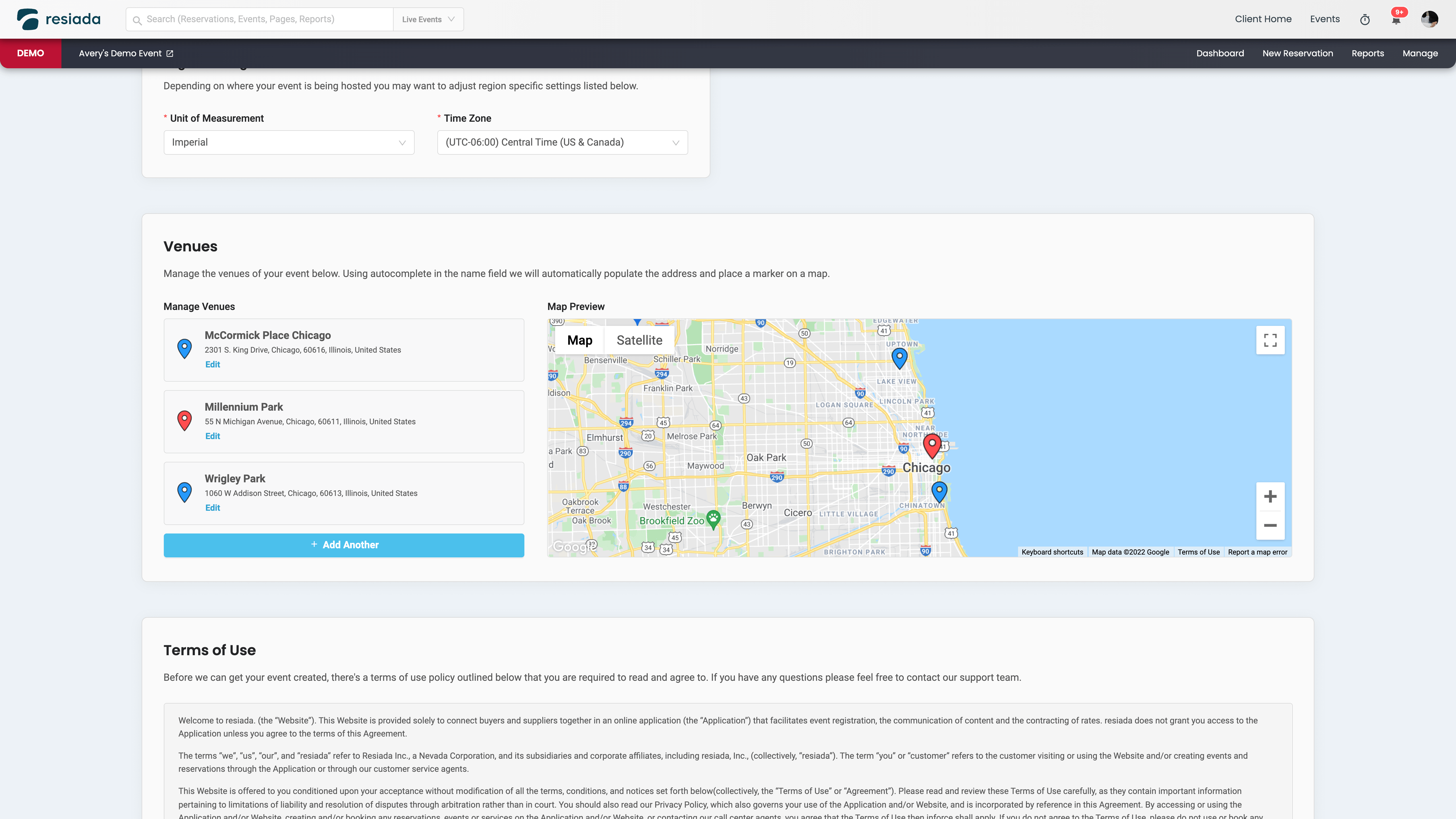
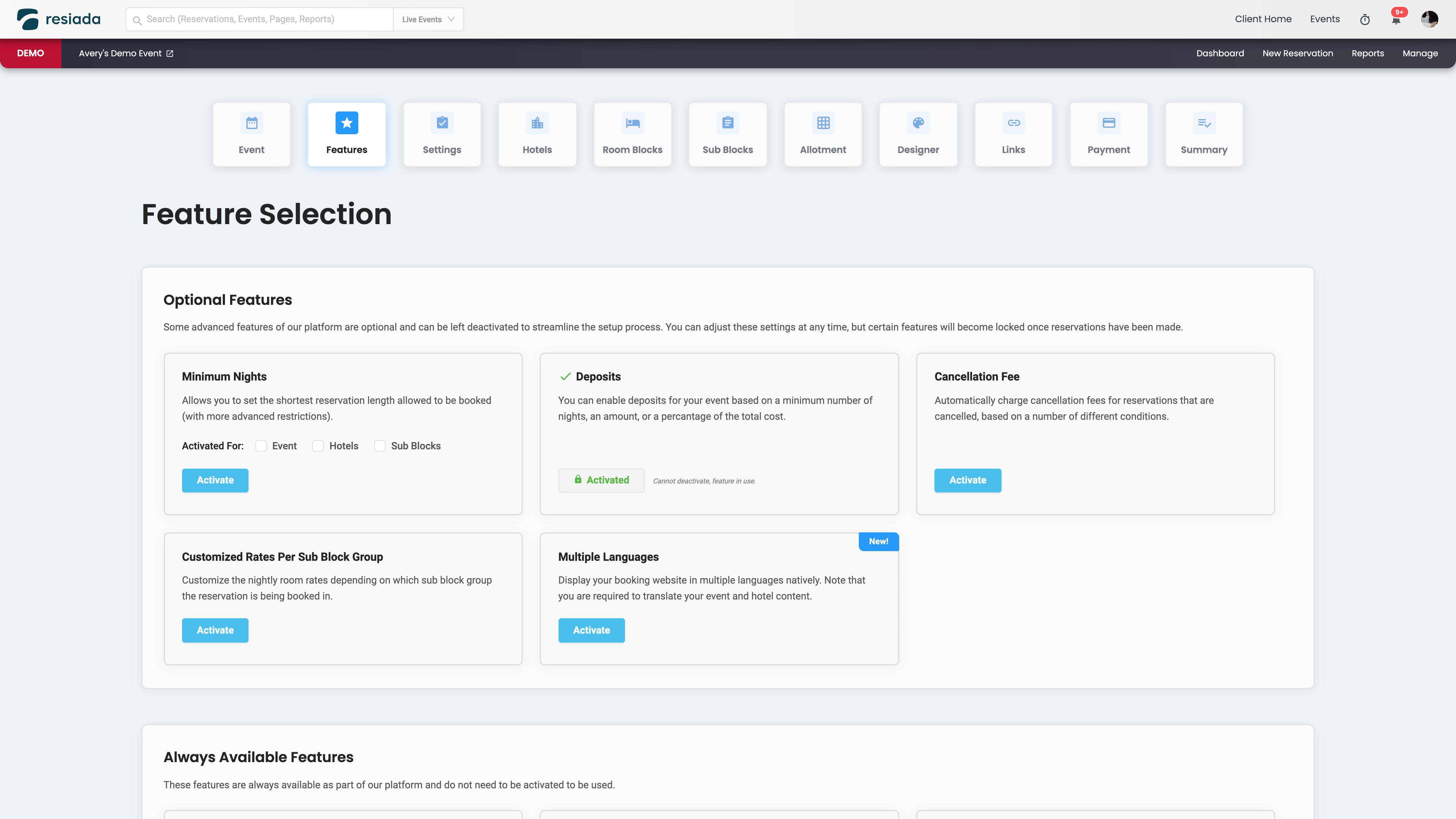
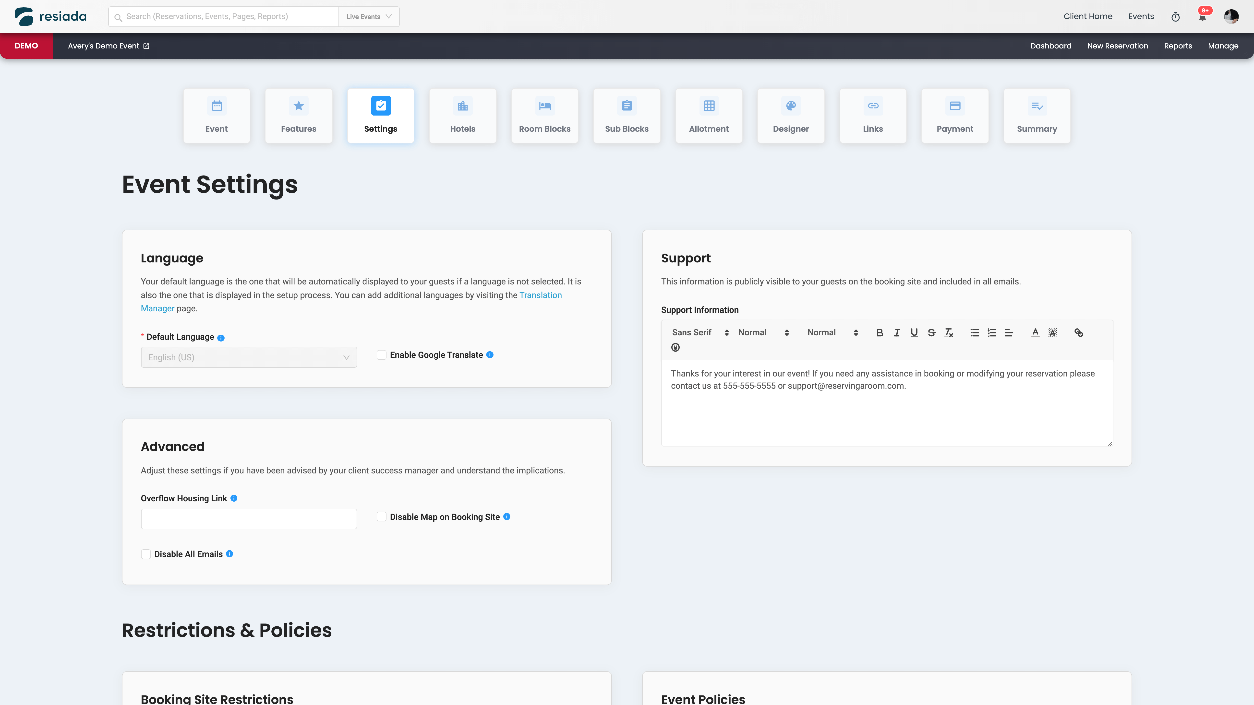
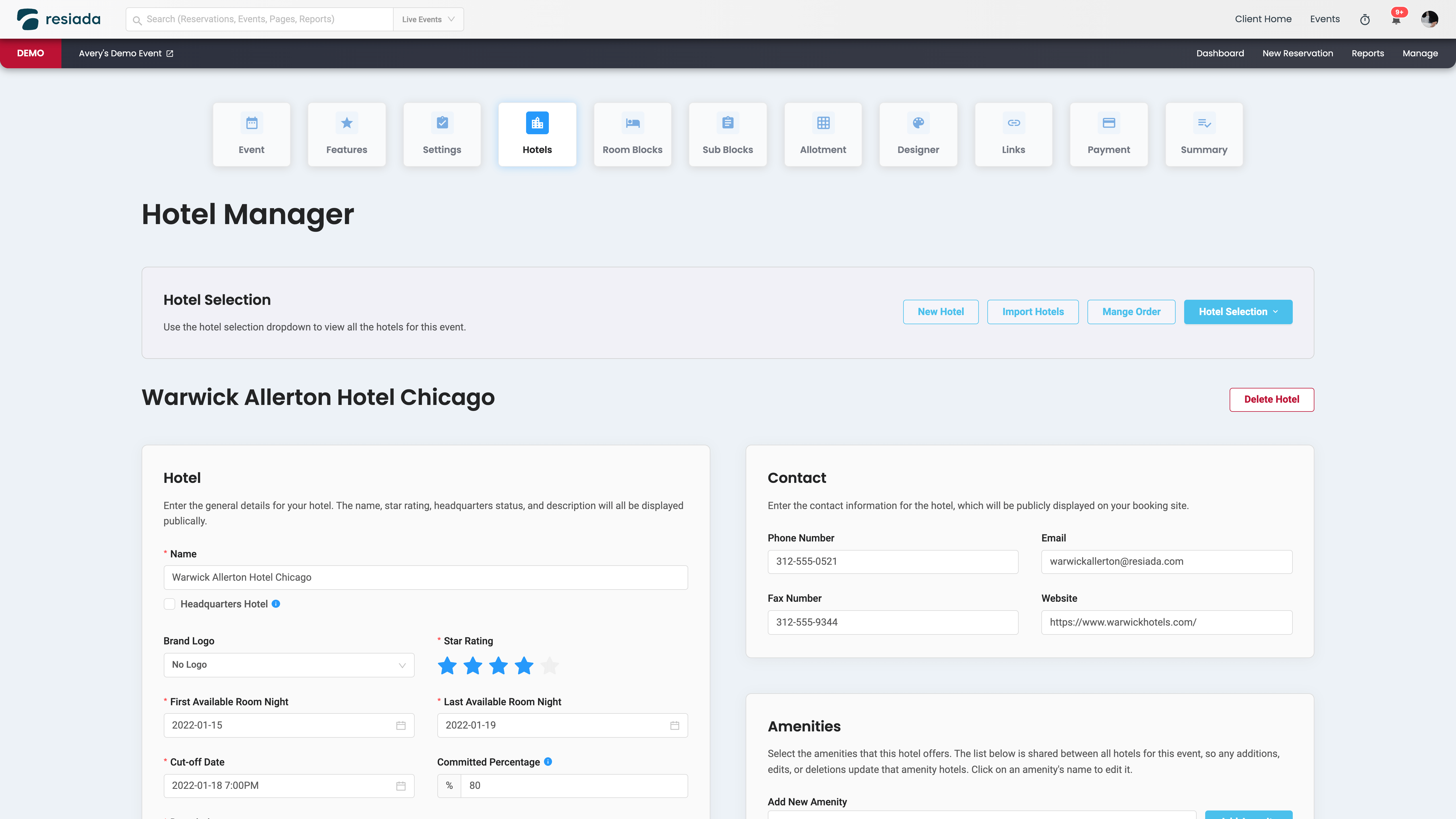
As we were collecting all the information required to properly set up an event we quickly discovered that it was way too much to fit in one page without being overwhelming. We also didn’t want them to have to go to different parts of the system just to build a simple/basic event.
After brainstorming we came up with the idea to build a guided setup process, which we internally called the “Wizard”.
Part of my process here was to interview all the different stakeholders and find out their priorities so that I could best adjust them. It took a while but we ended up on a flow that everyone was happy with, shown below.
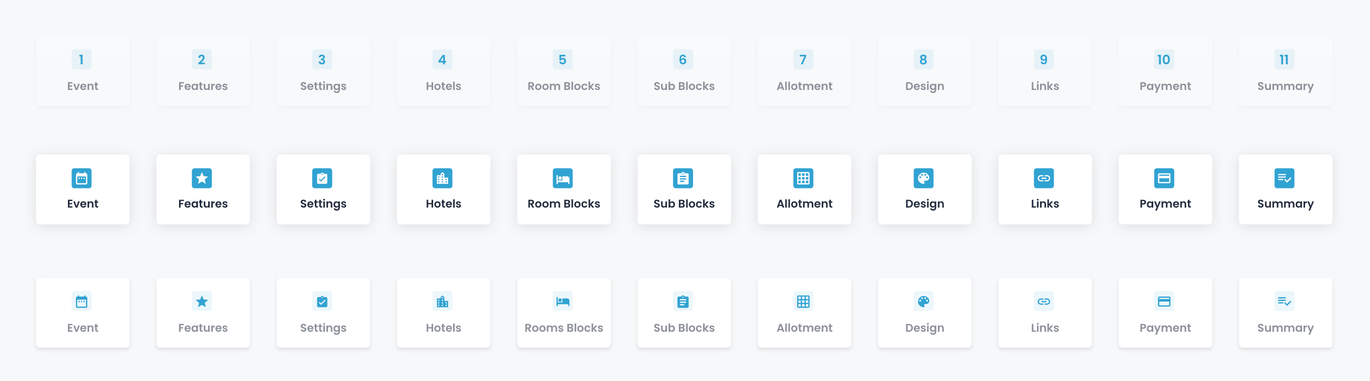
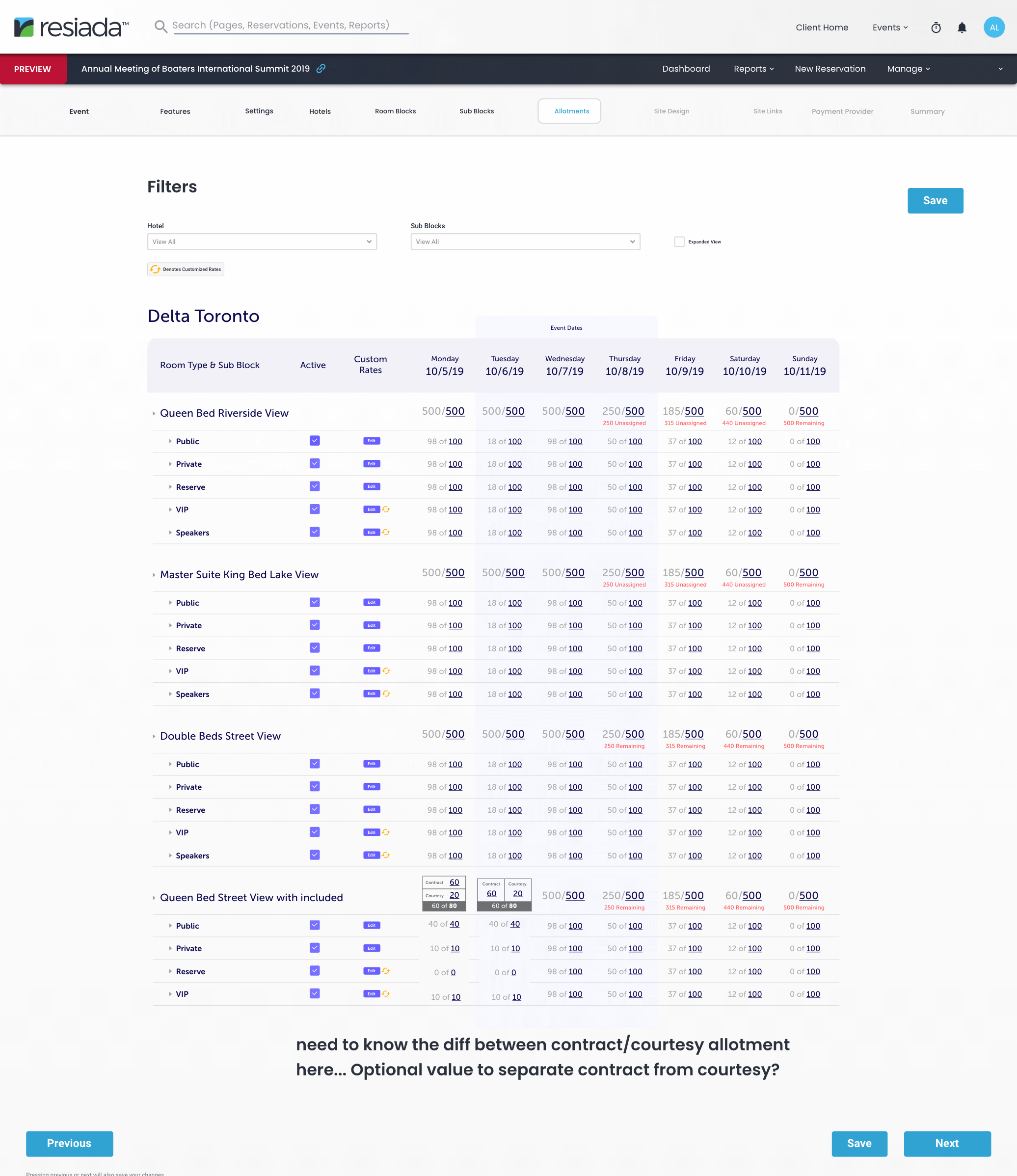
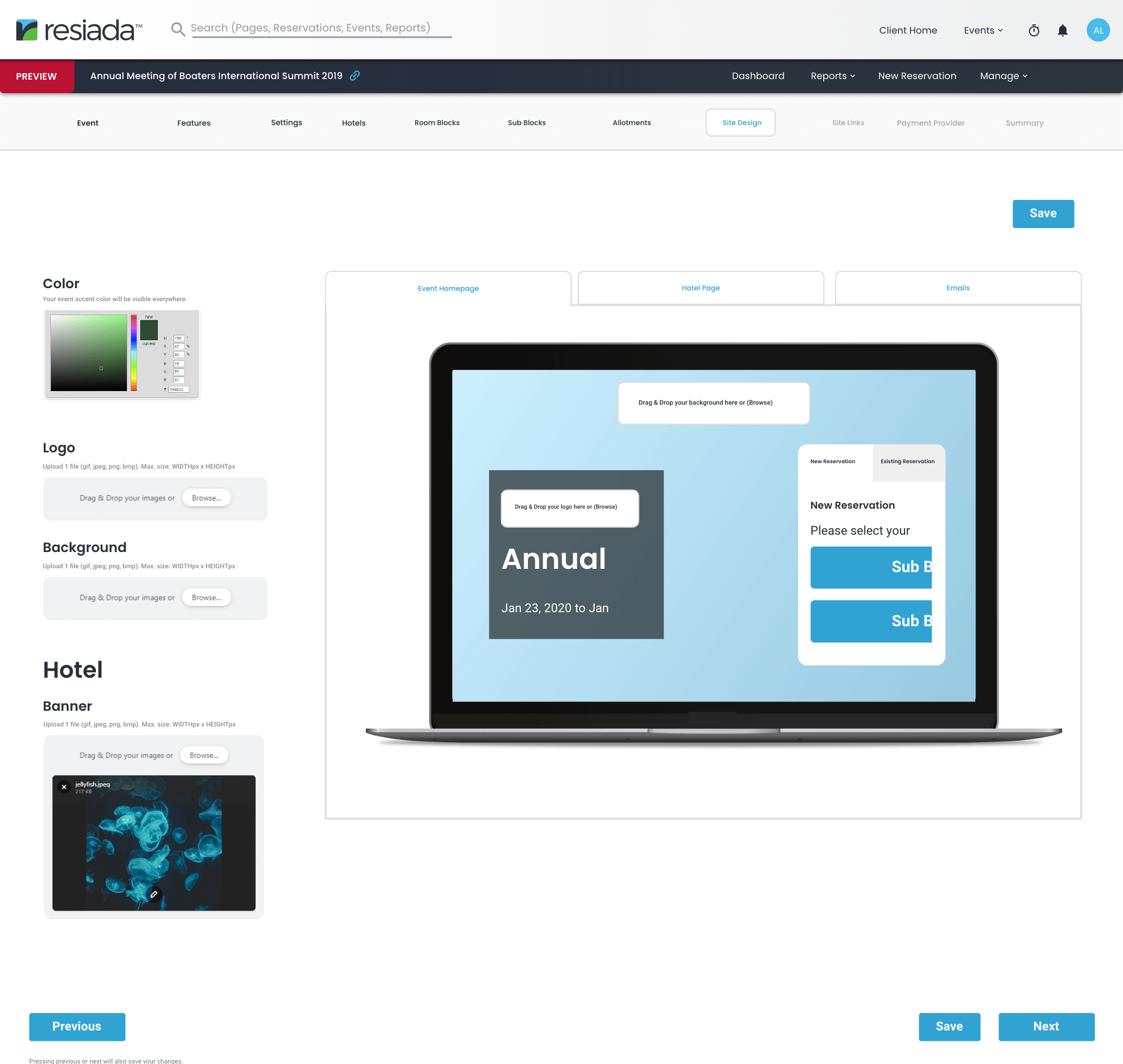
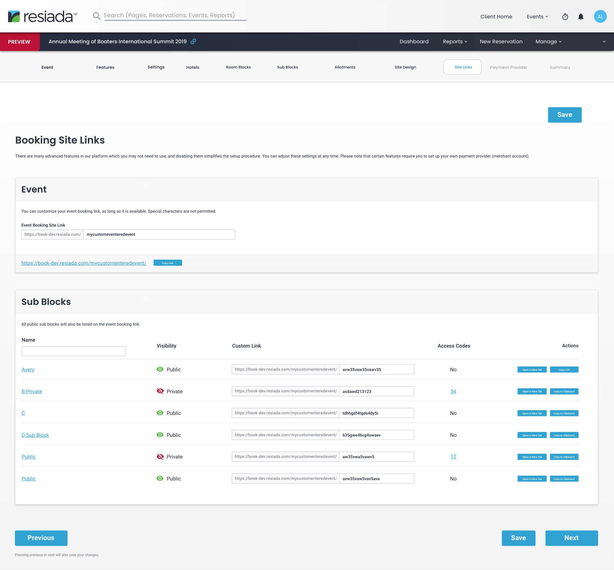
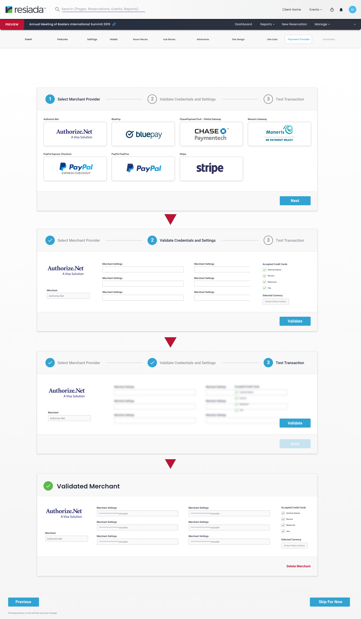
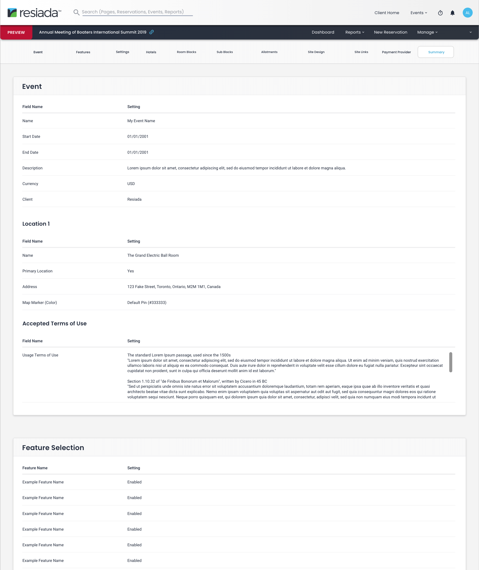
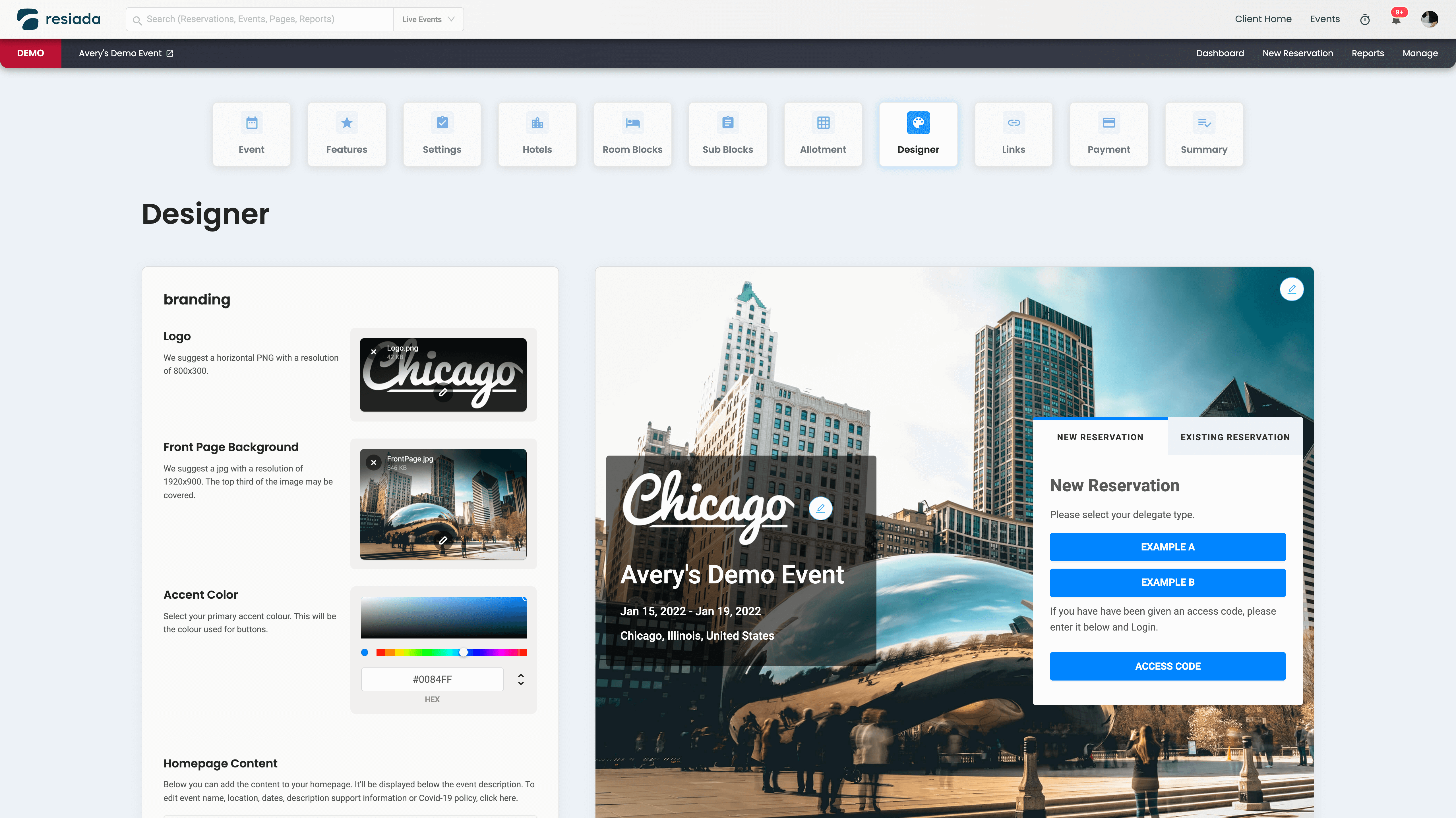
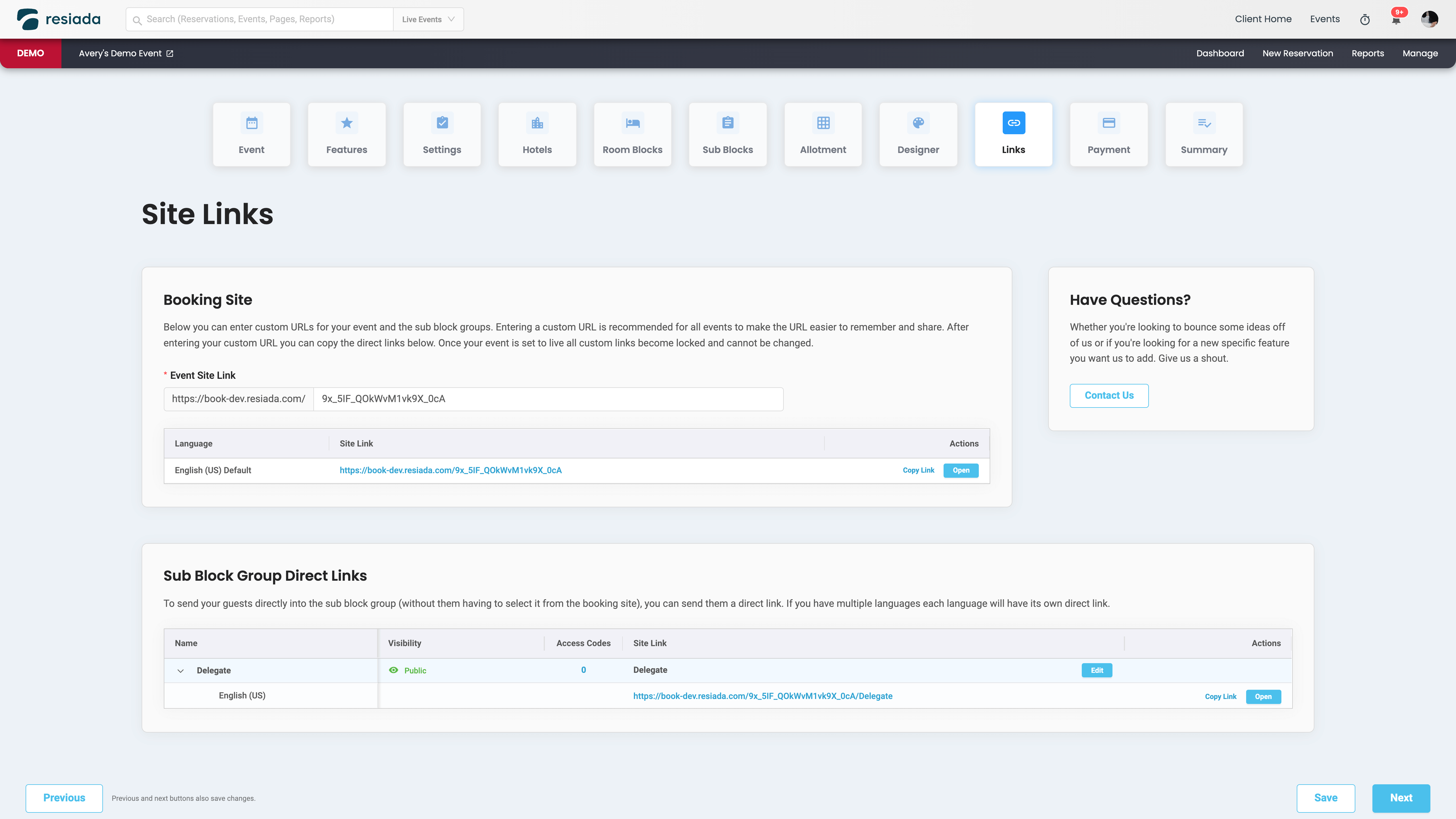
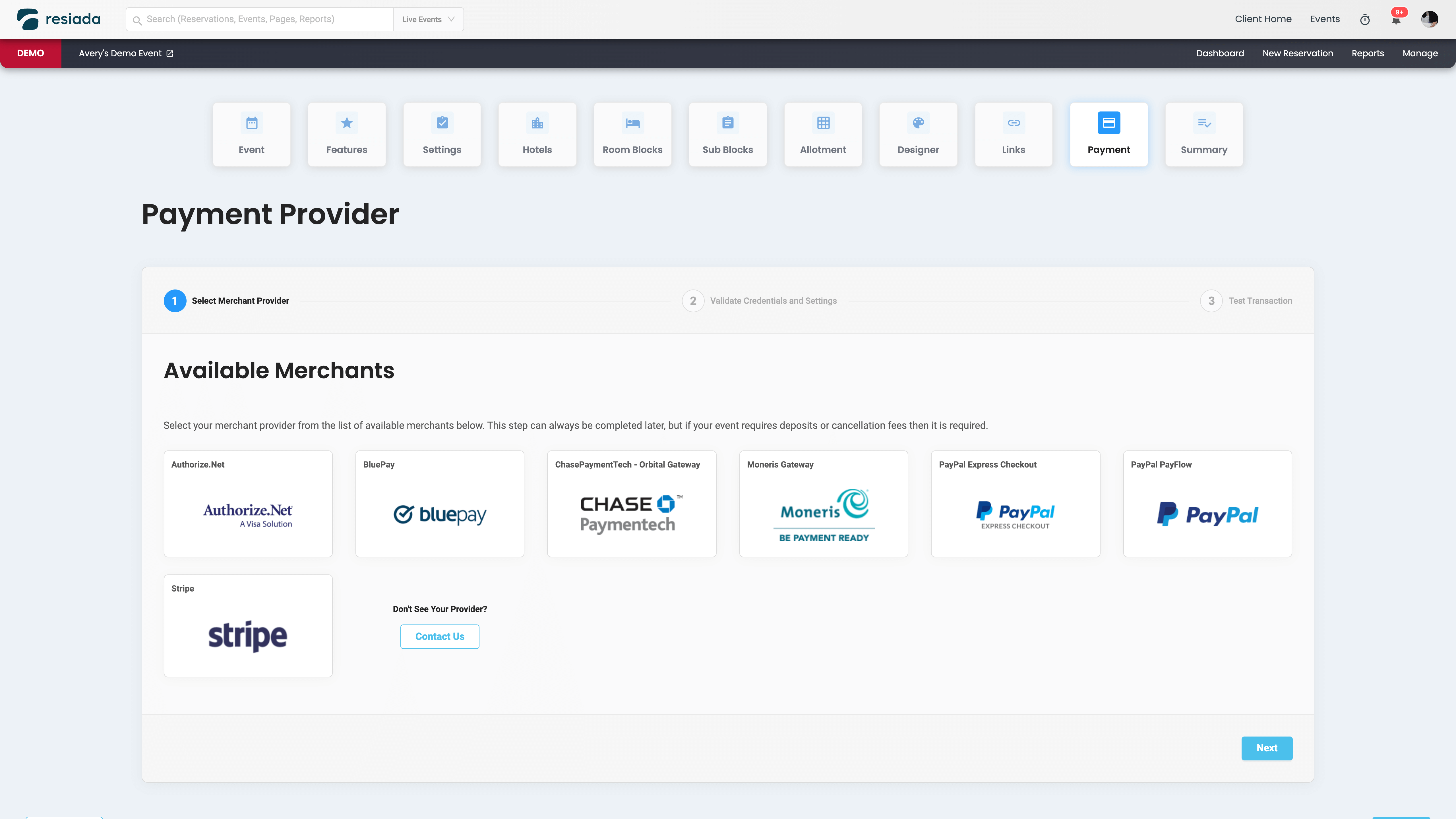
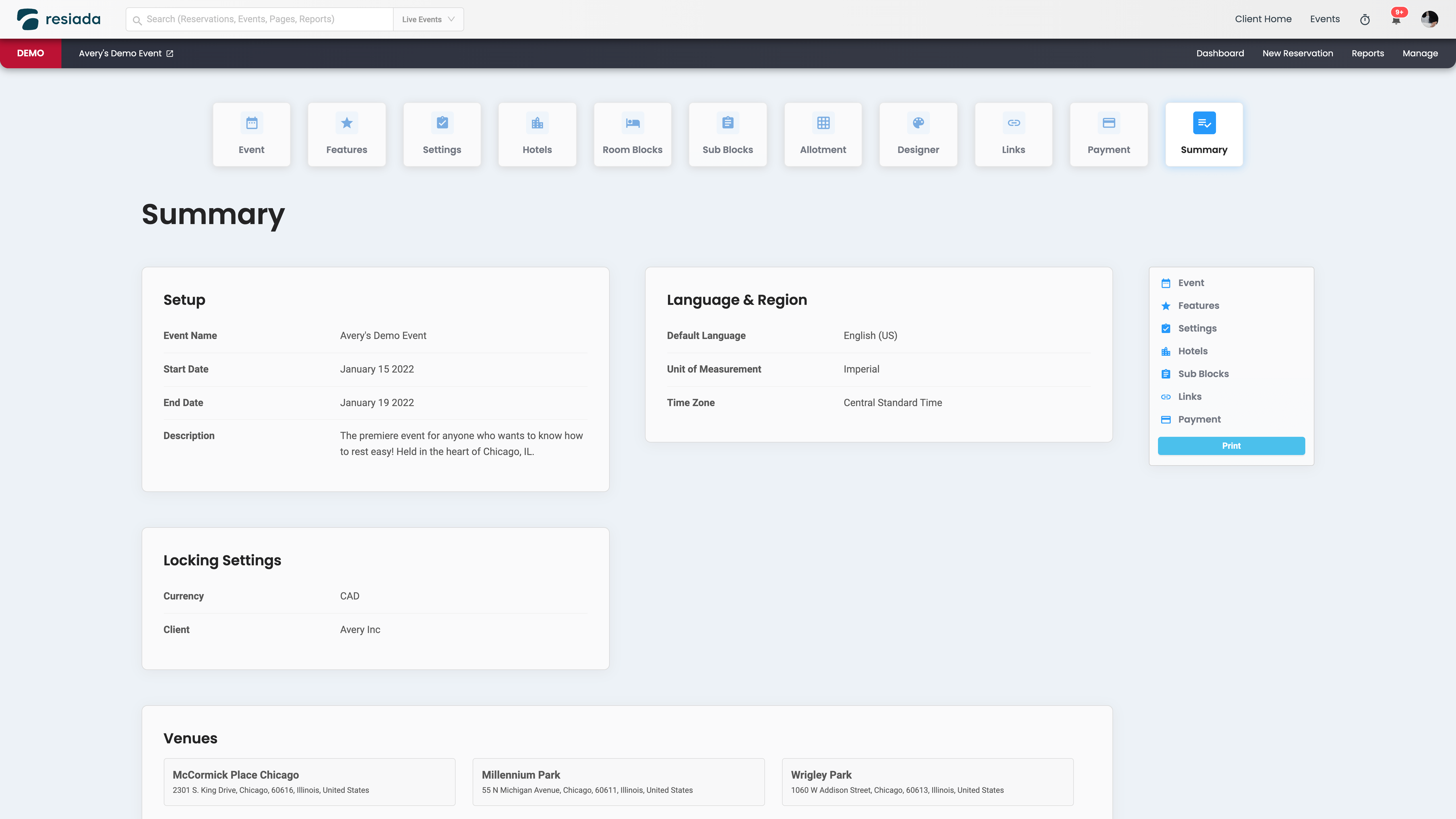
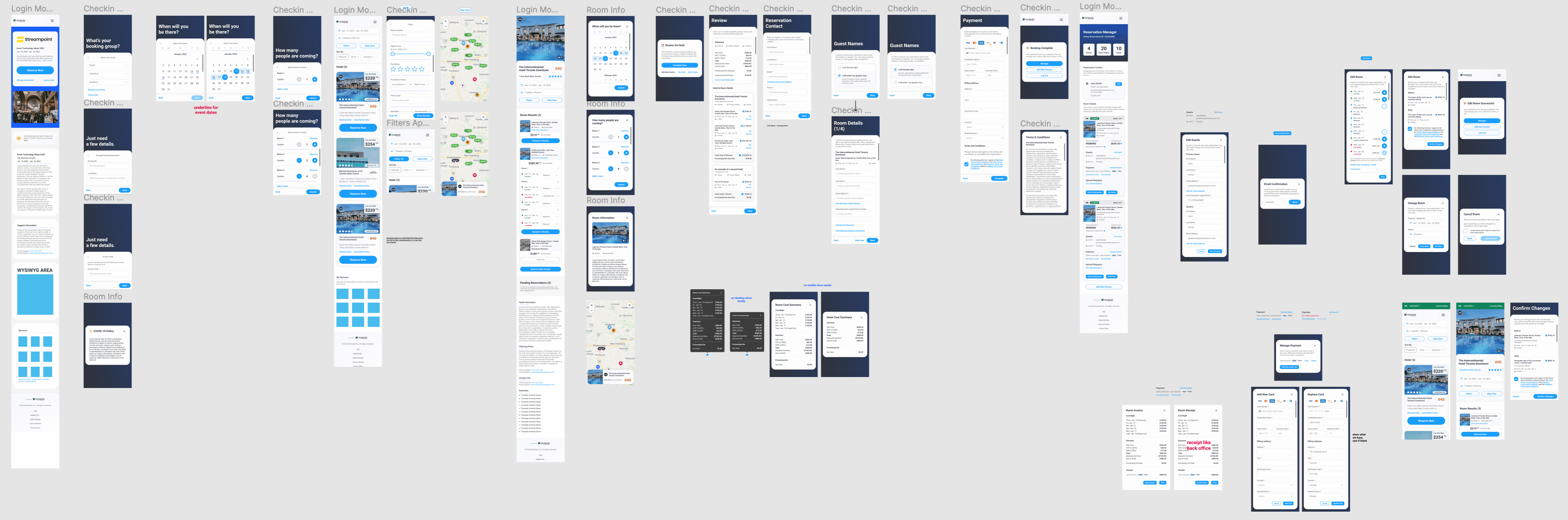
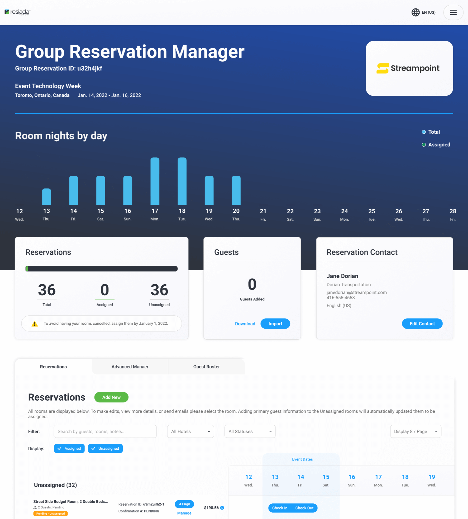
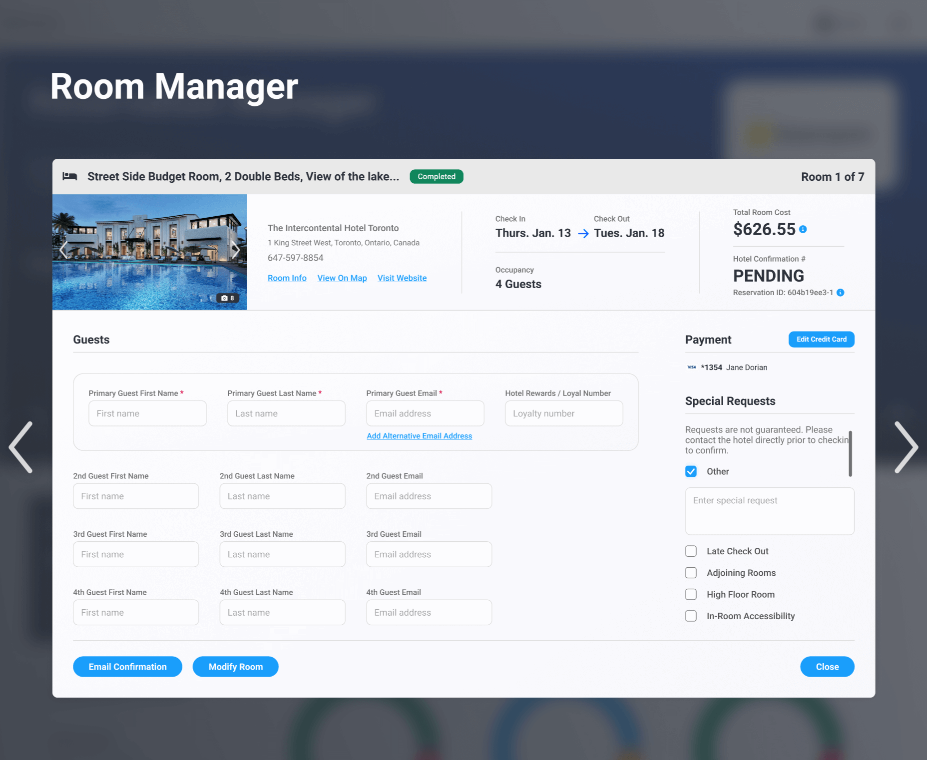
Setup Flow aka “Wizard” Mockups
With that in mind we collected all the necessary inputs we would need for an event and organized it into the decided steps.
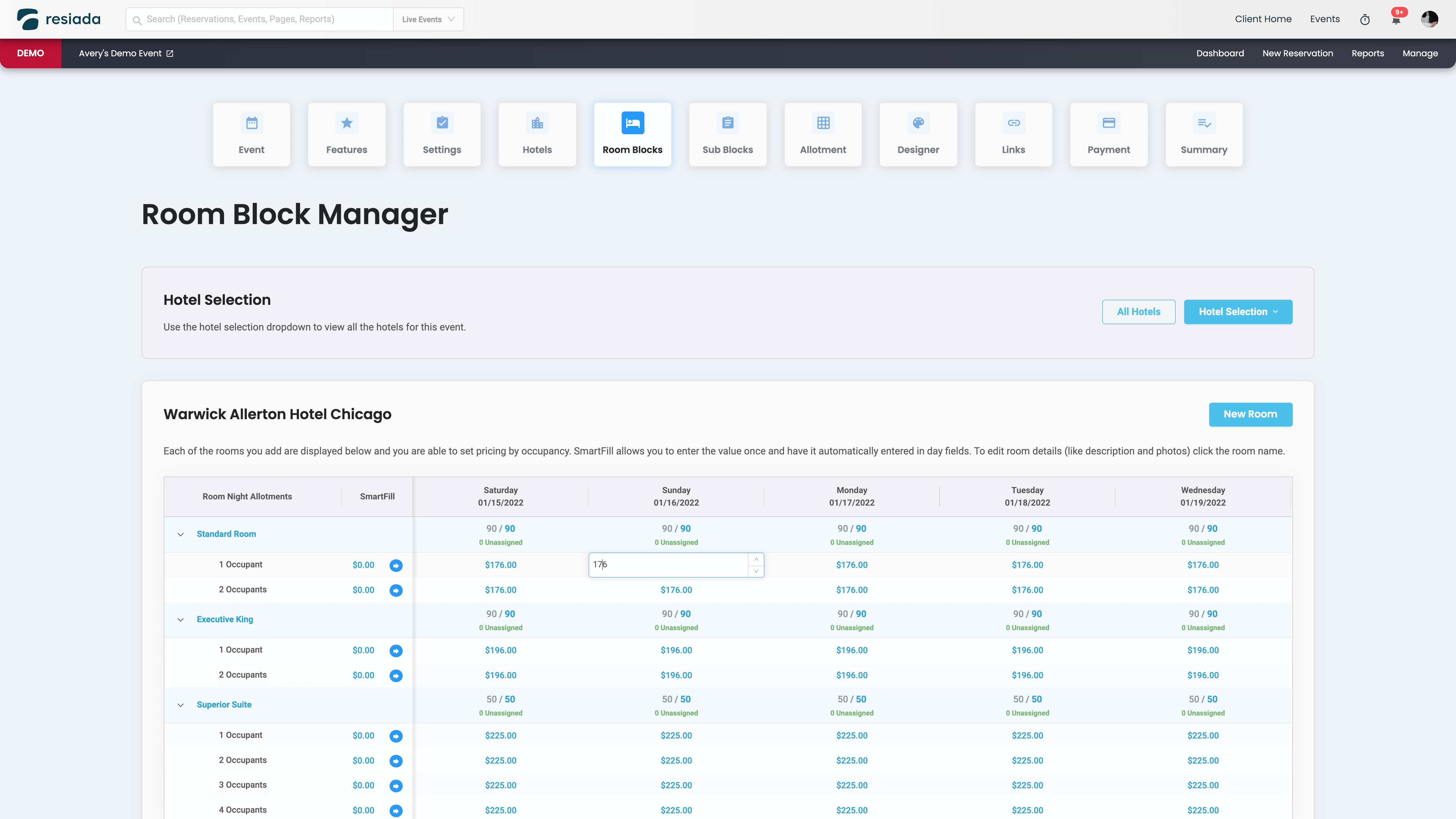
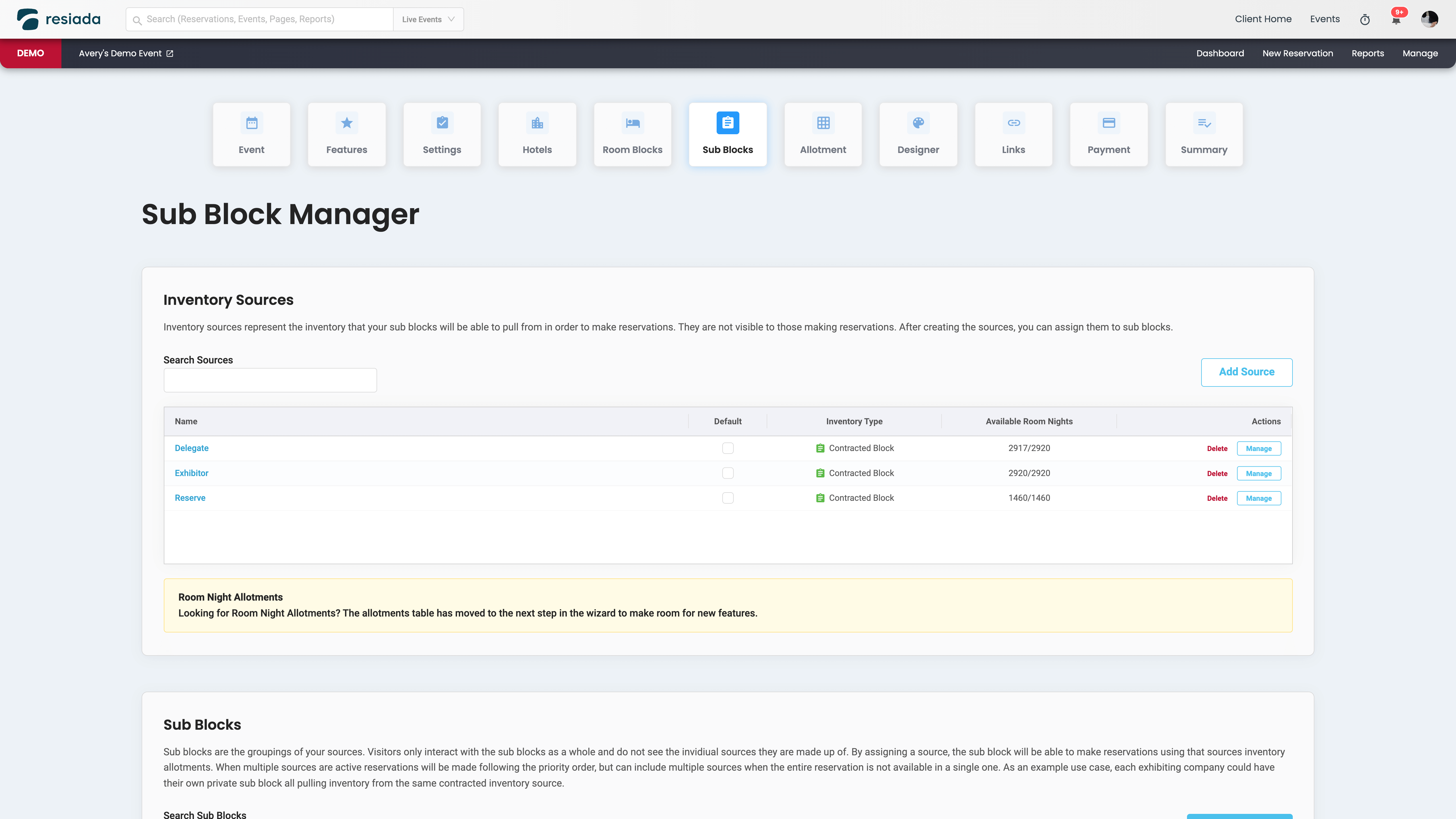
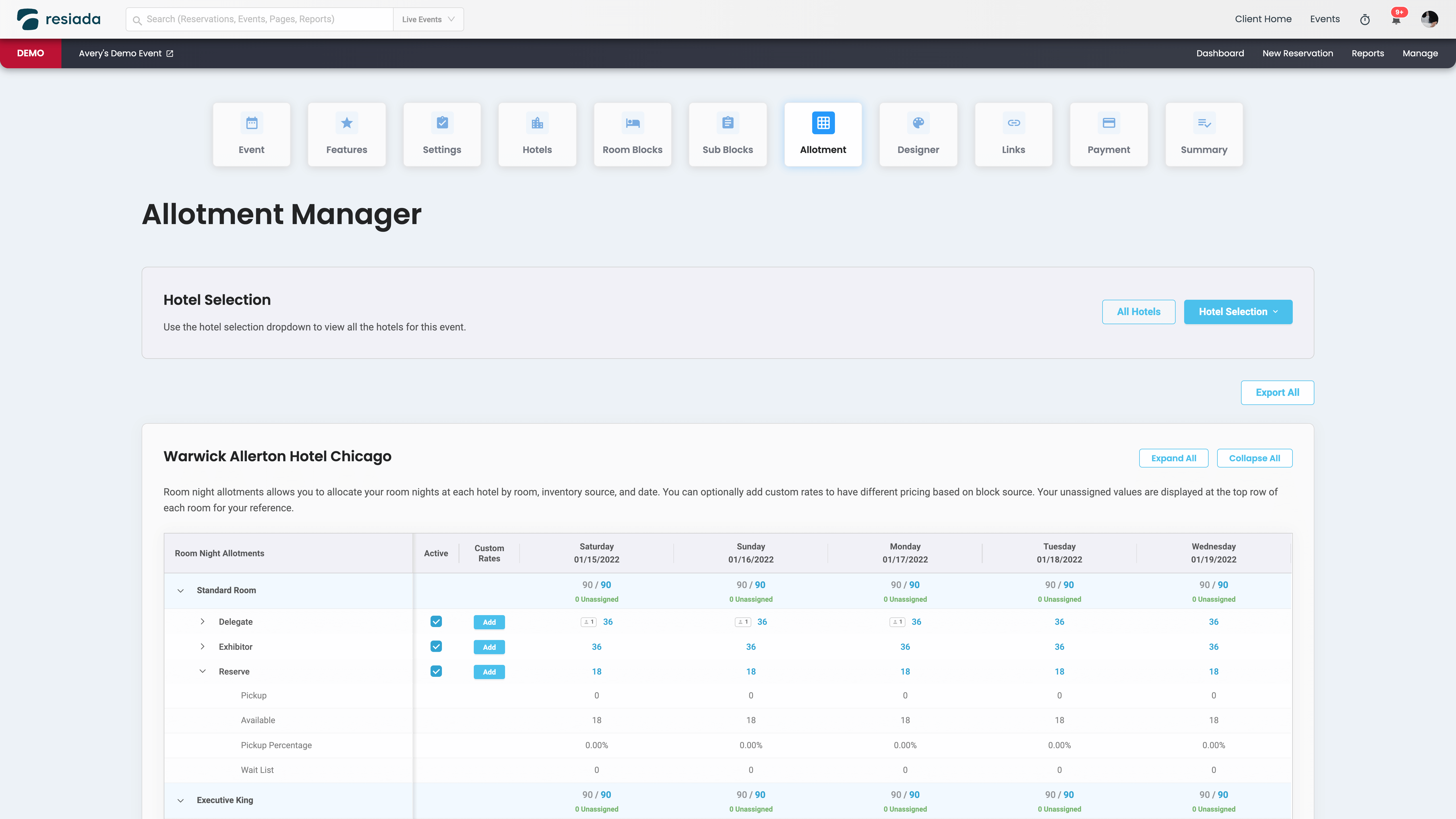
One of the key components of the wizard was that it let us find out early on exactly what features each event needed. We would then use that information to dictate which specific inputs/data would be required to create that event. This allowed us to essentially have a custom interface for each event, only showing what they need and hiding what they don’t need.
For small or simple events it made the wizard an extremely quick and easy process, but it also let complicated or large events still have easy access to all of our advanced features.
Throughout the entire process of organizing settings into “features”, and organizing those features in the hierarchy of the wizard, I regularly met with all stakeholders. By having them all involved regularly it made the entire process much smoother. With the features and steps decided, organizing the inputs based on the step they should fall under went fairly quick and painlessly.
We created the below rough mockups of the result and took those to clients, stakeholders, and coworkers to gather feedback, changes, and just general input. Universally it was well received.
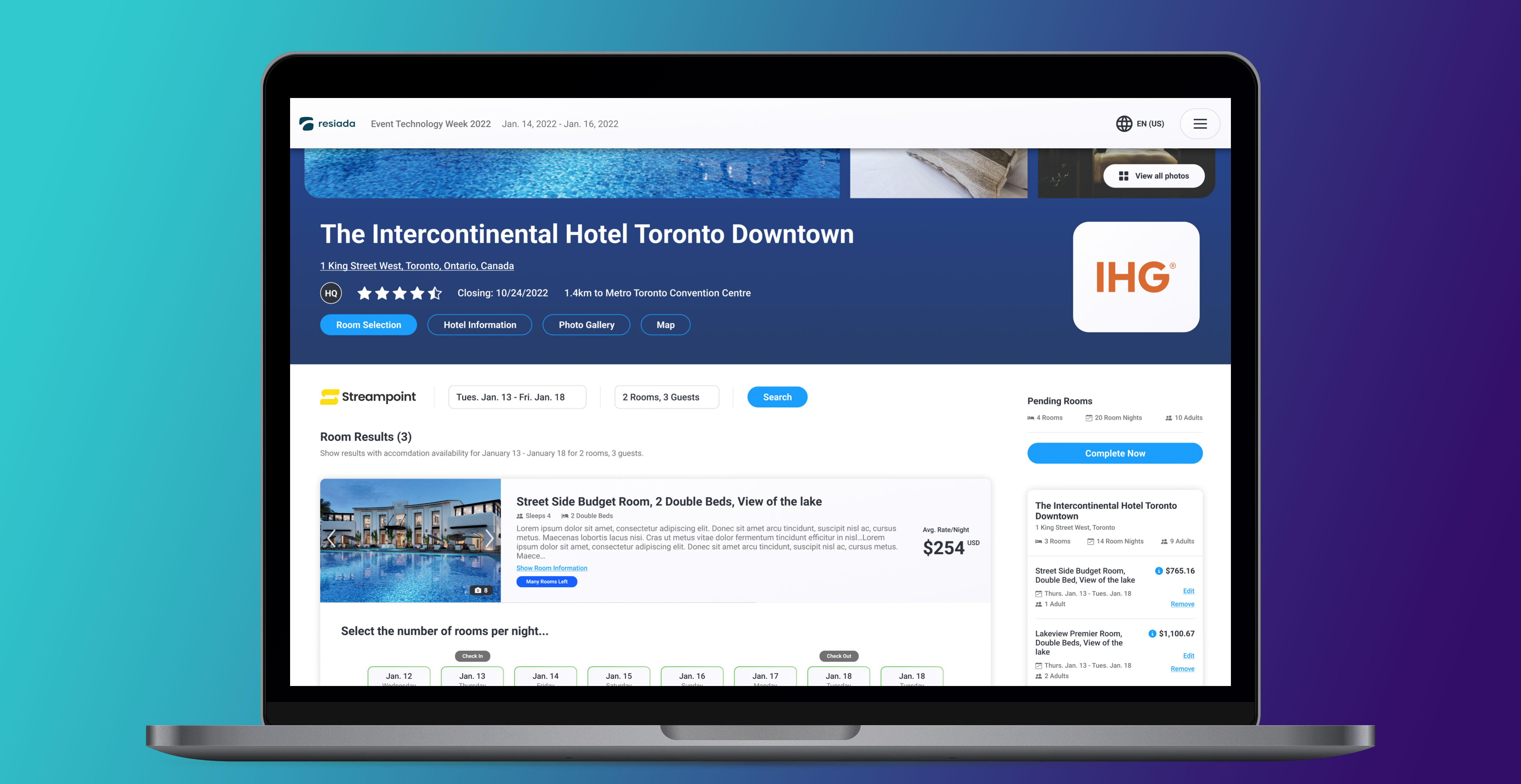
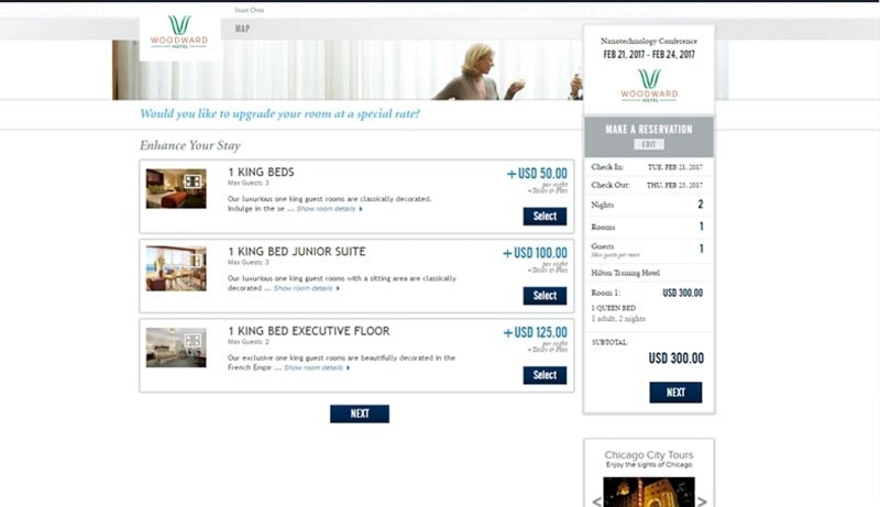
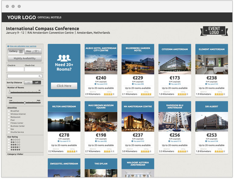
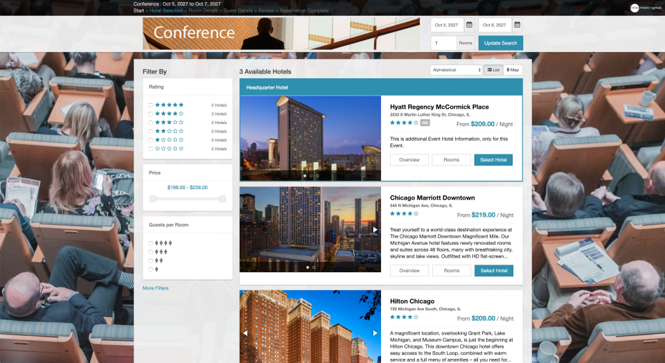
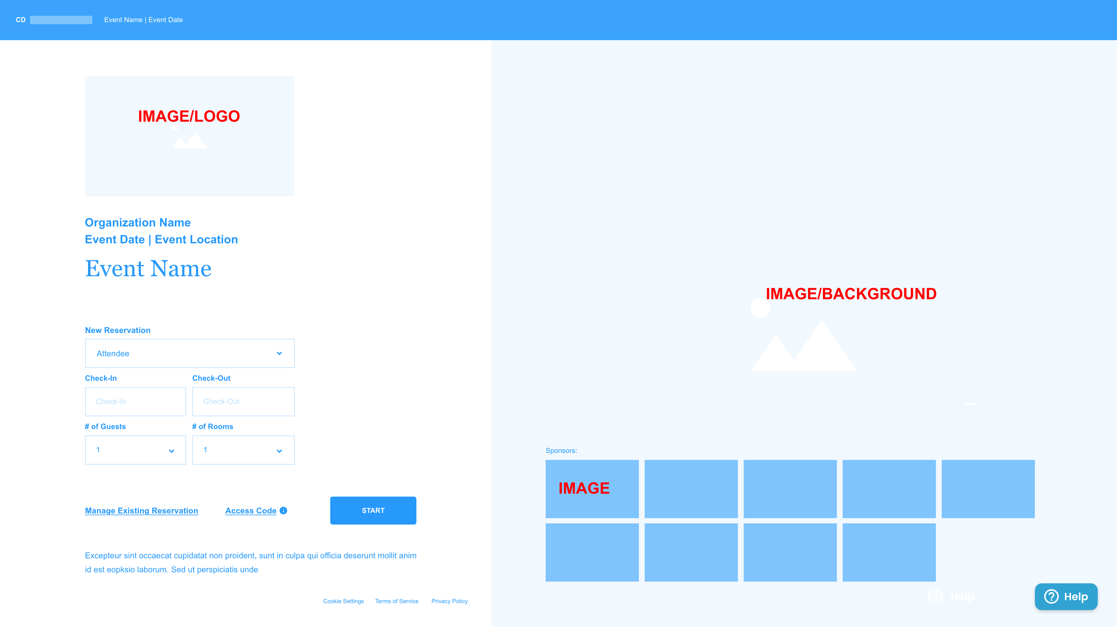
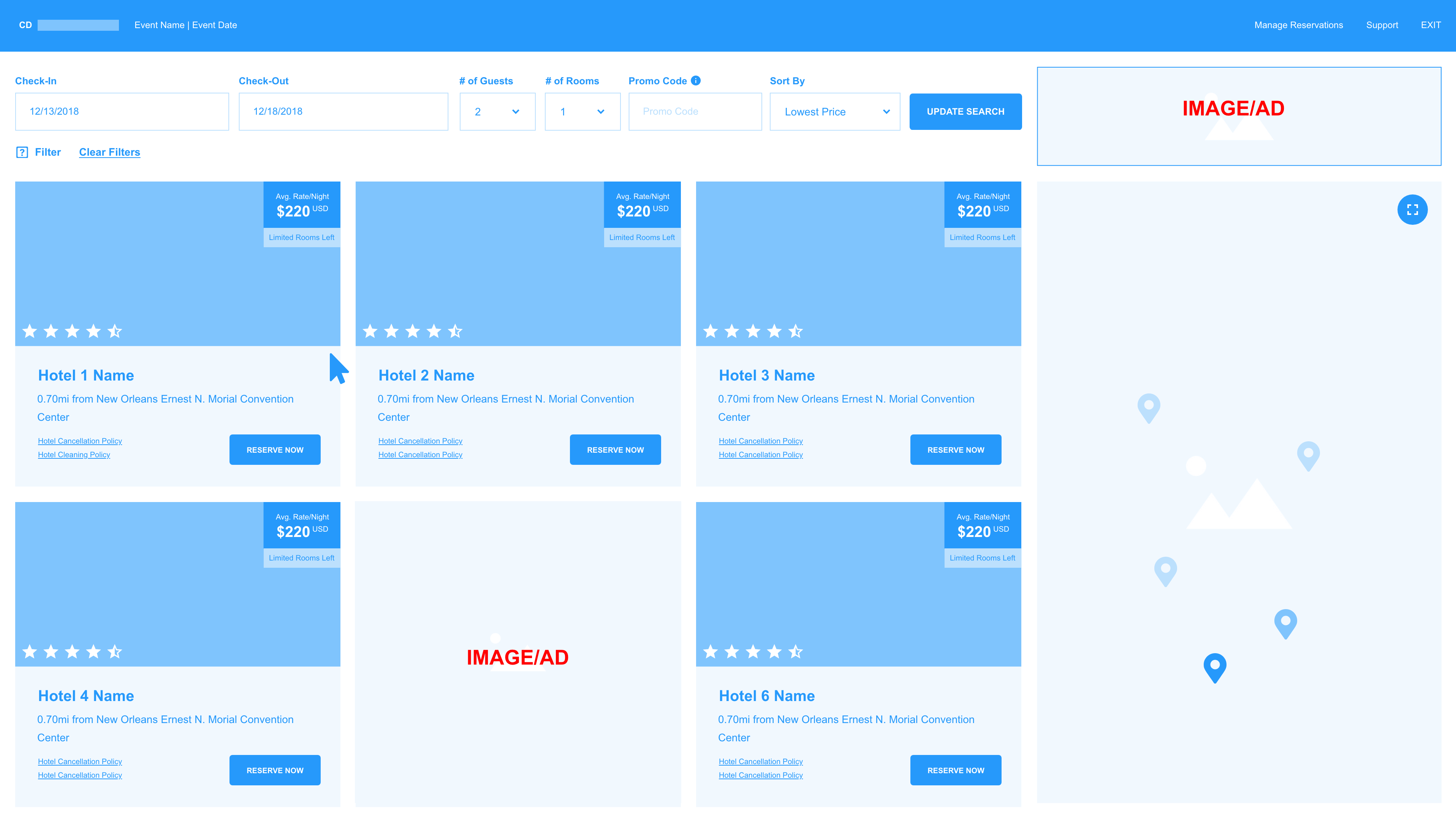
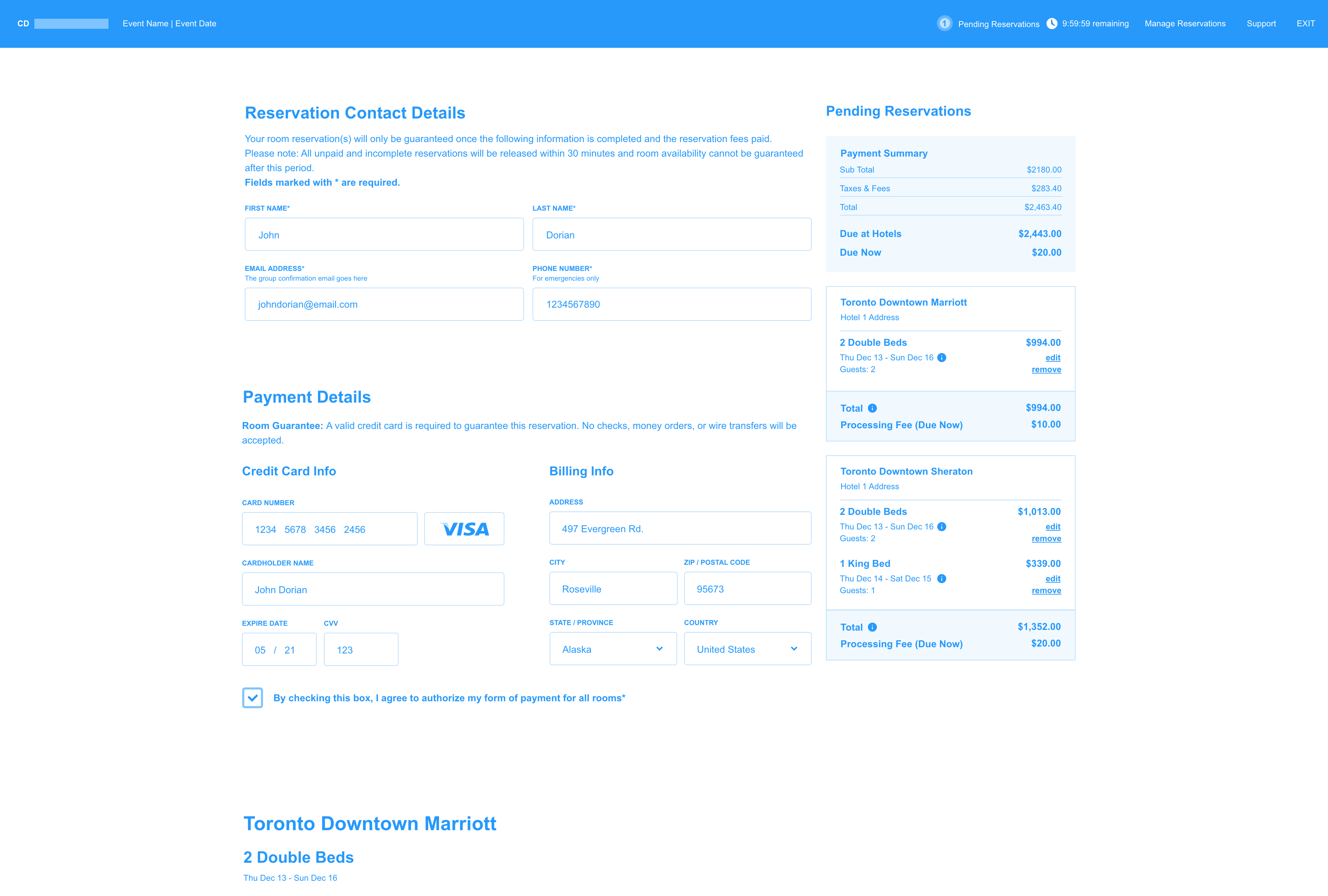
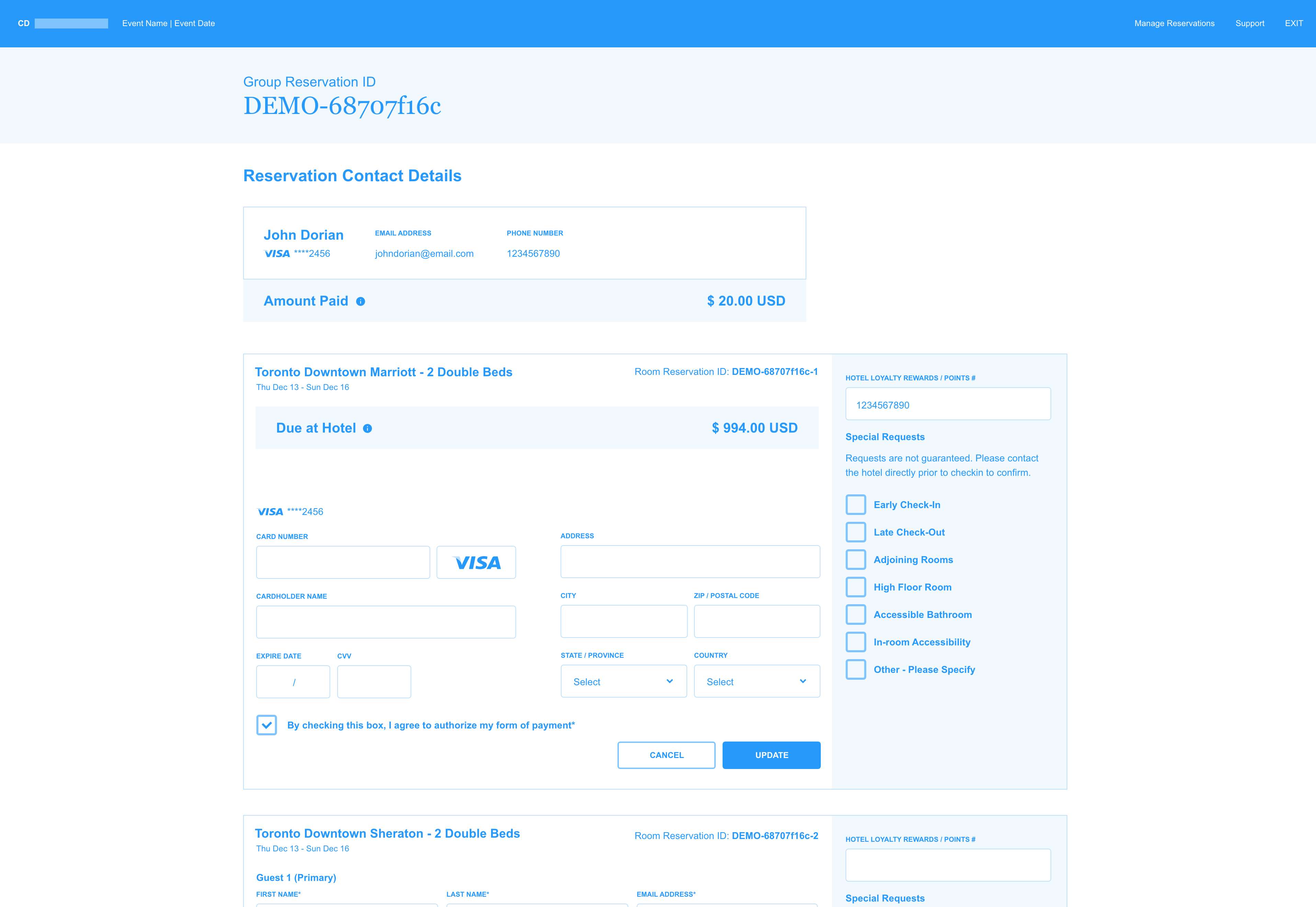
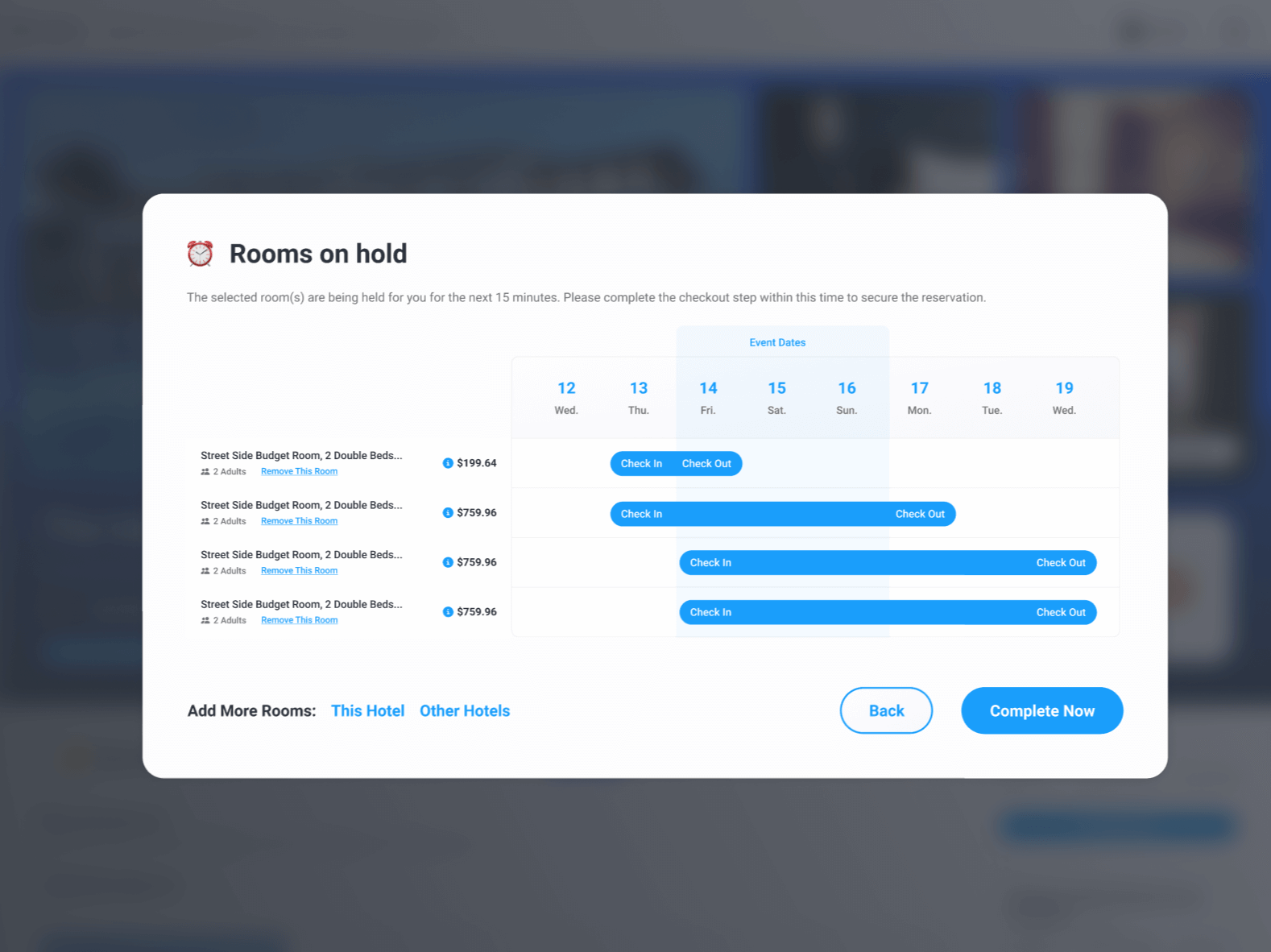
Booking Site Mockups
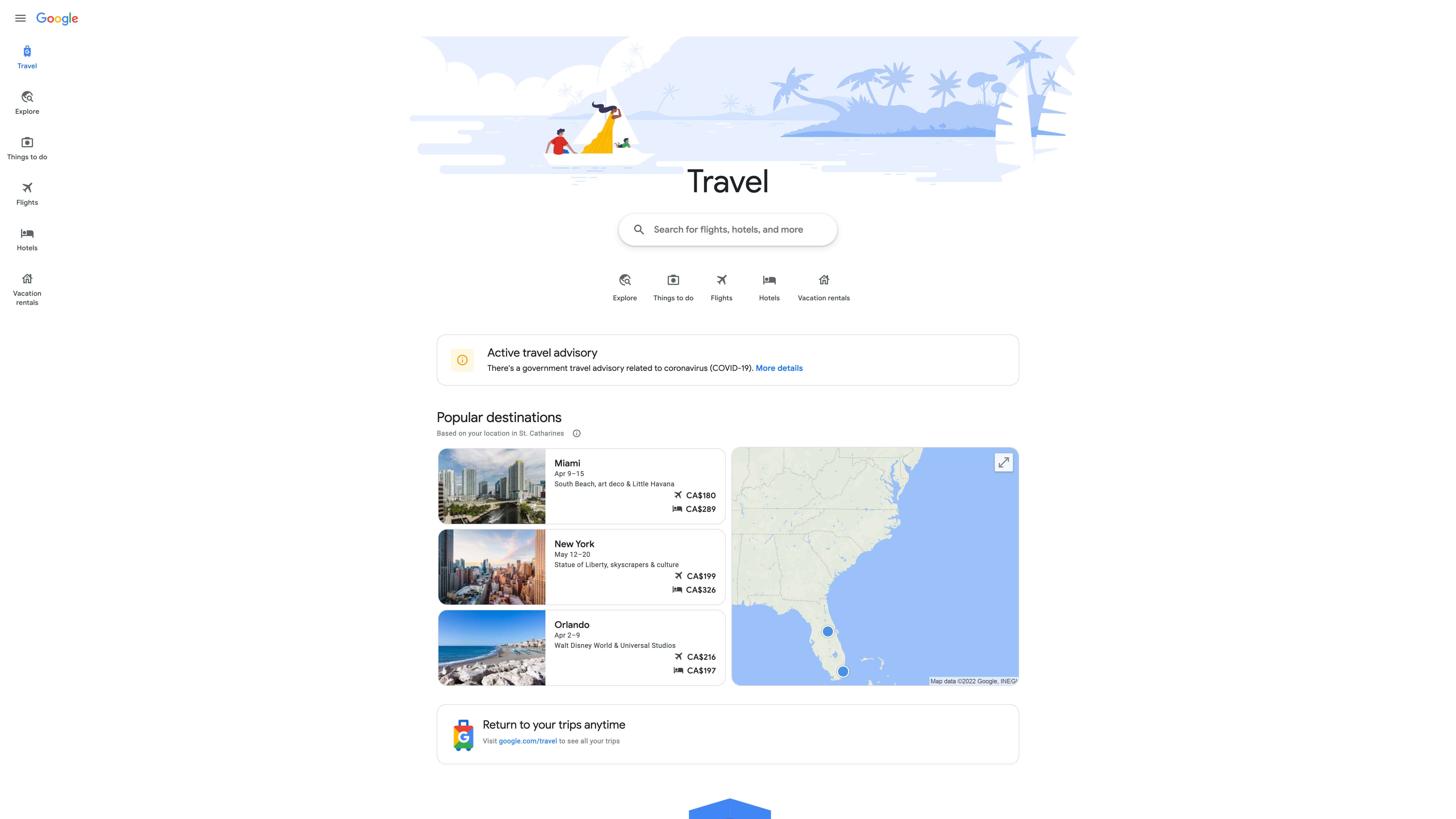
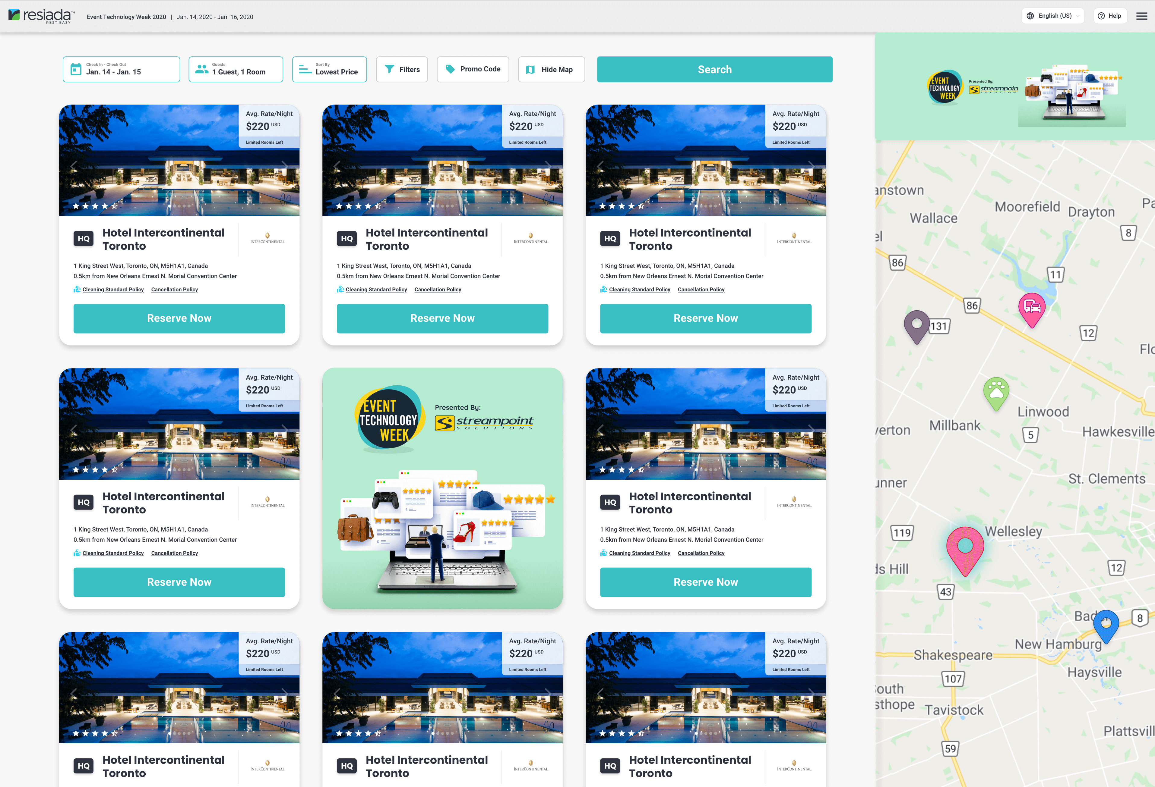
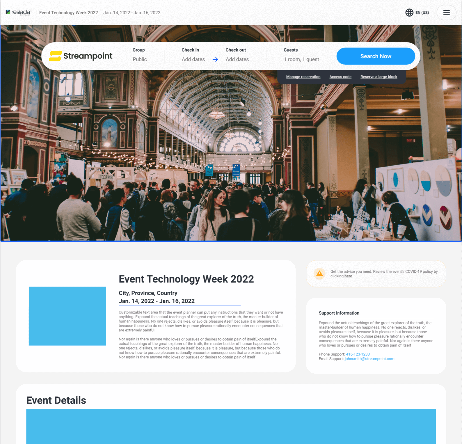
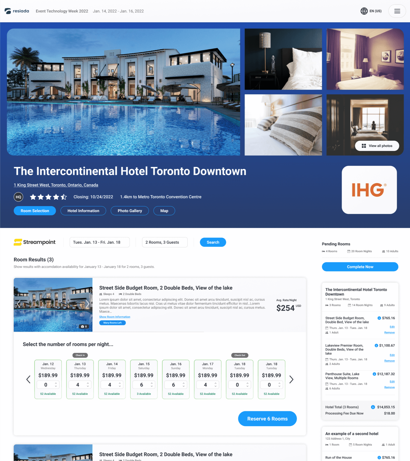
The other piece of the puzzle was the booking site; this is the place where the actual event attendees would go to book their hotel rooms through our platform. It’s the public facing portion and required to be fully accessible to all.
We thoroughly reviewed all our competition and came up with a basic flow that we thought would cover all our requirements. After presenting it to our external stakeholders we received a massive amount of feedback that I compiled, analyized, and tweaked resulting in the below overall draft flow.
One of the important decisions we made was to use a very basic colour scheme in order for the feedback to be focused on the UX. This was instrumental in streamlining the feedback received.
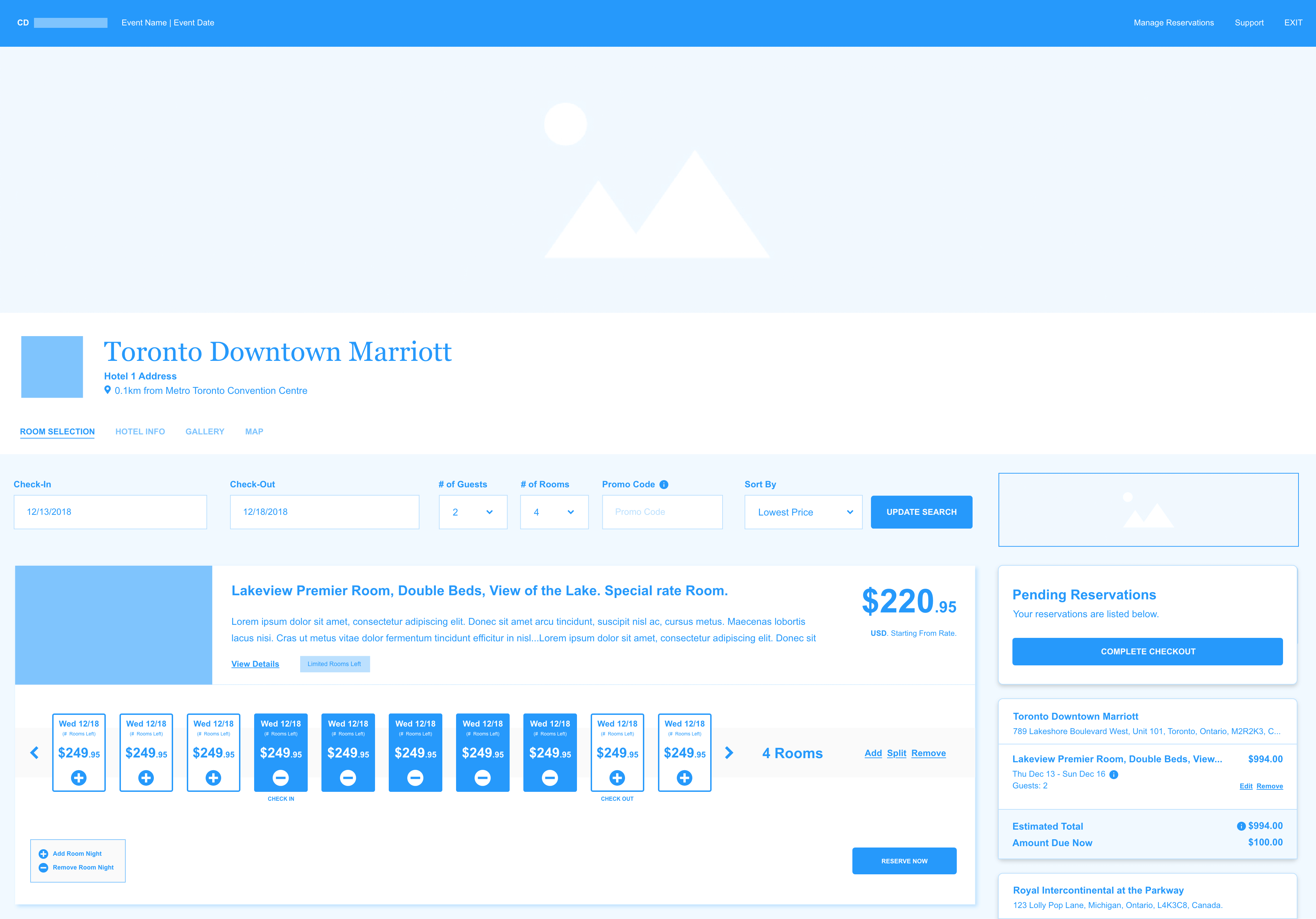
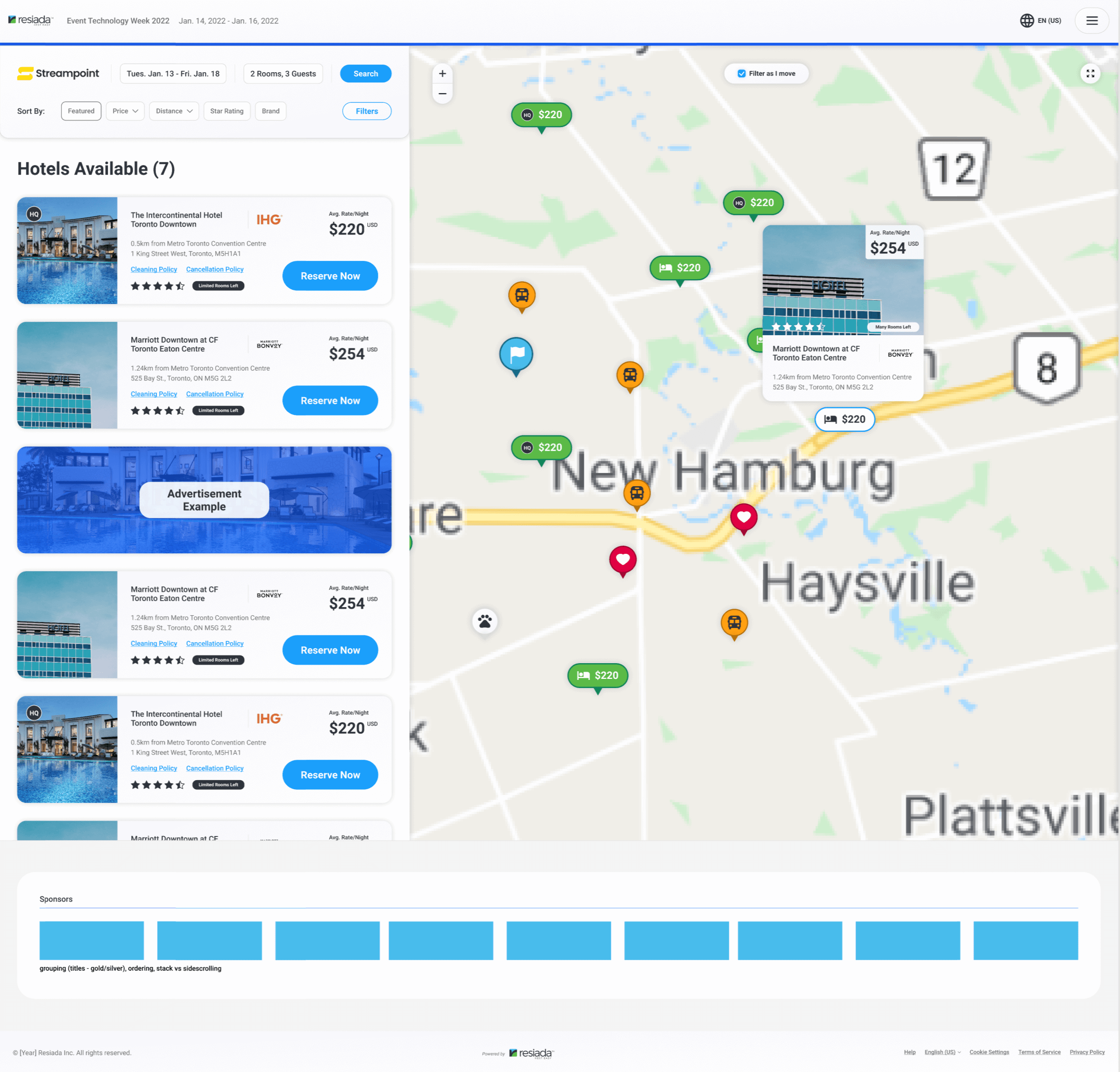
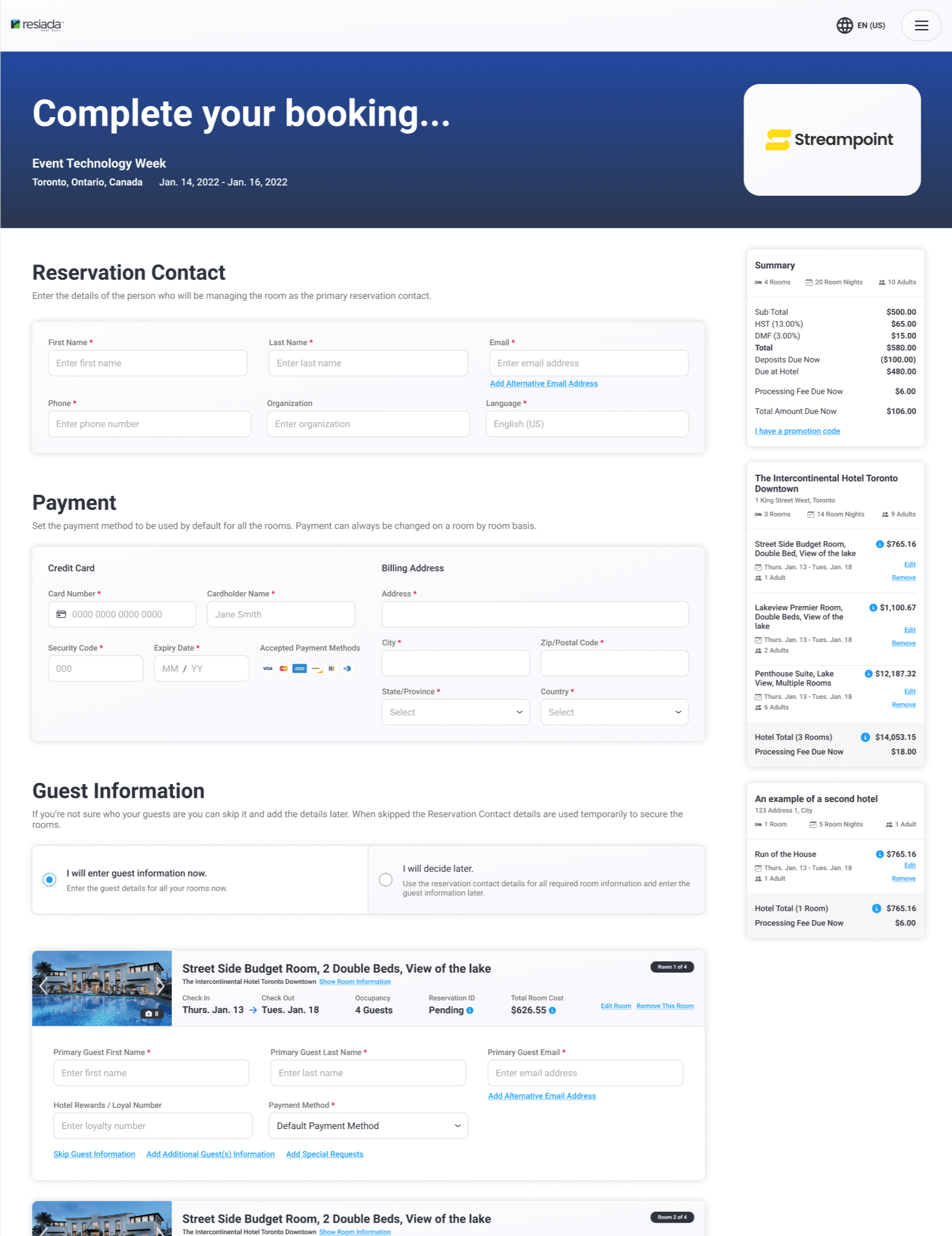
Booking Site Mockups – 2nd Revision
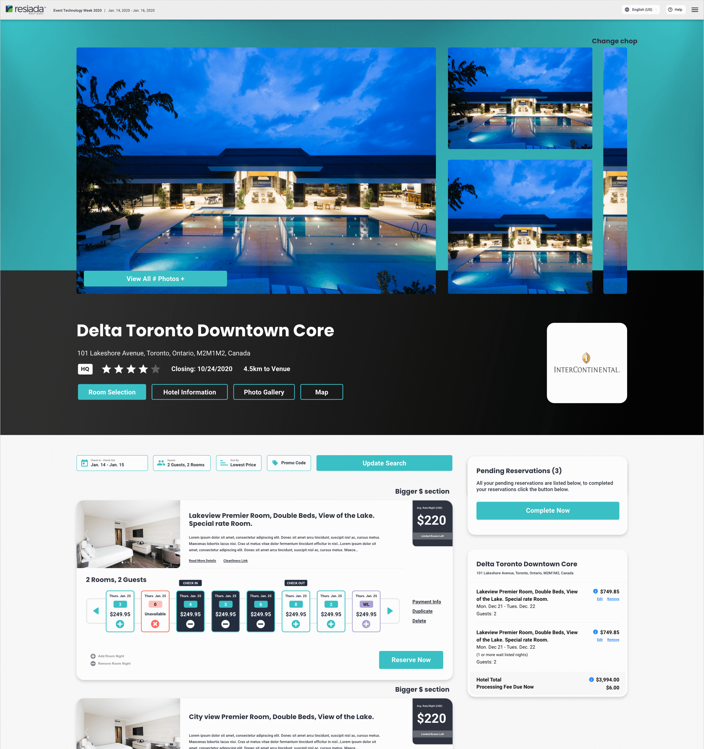
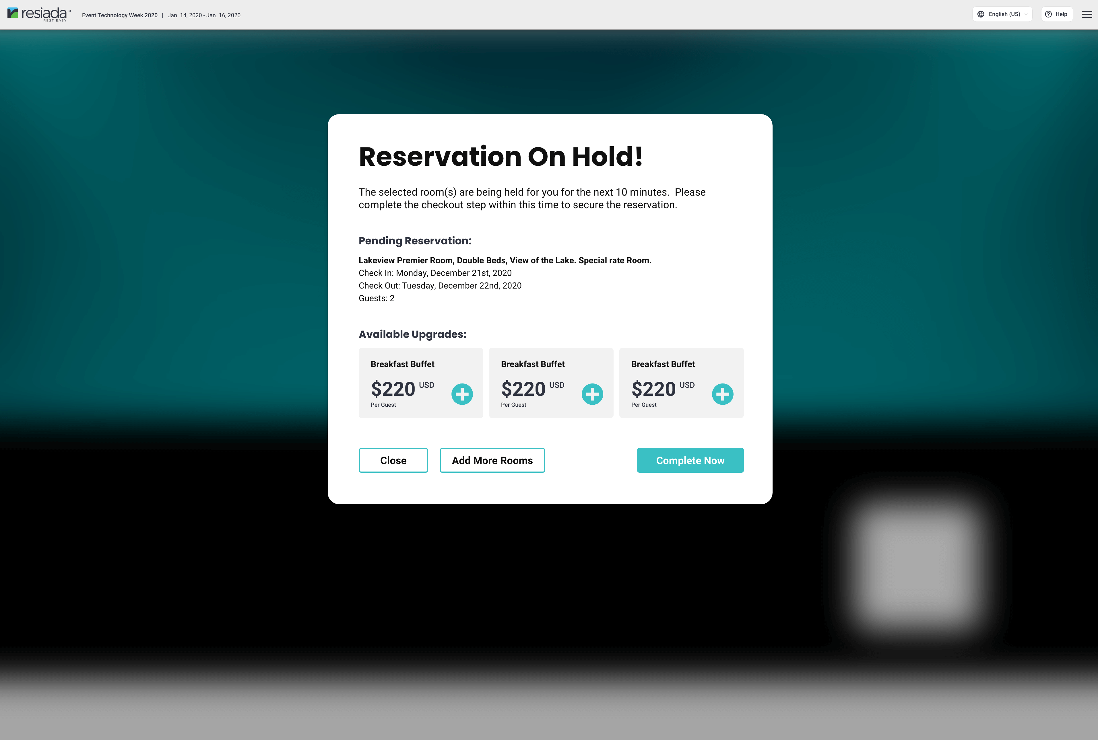
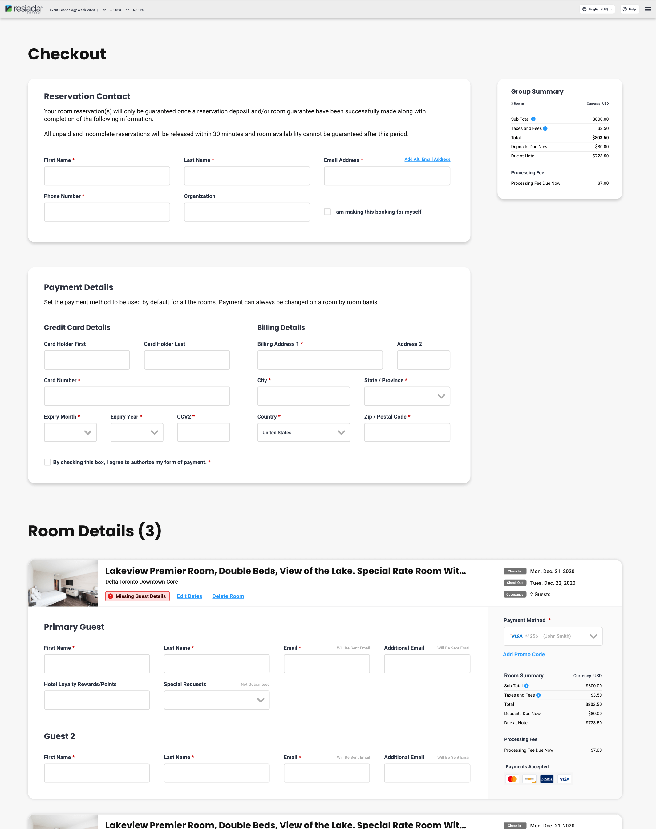
After reviewing with the entire team and external stakeholders we sorted through all the feedback and I went back to work. We came up with the below which was a progression of the previous flow.
It was important to present a more finalized flow before proceeding as we were presenting it to investors as well as current clients. With the previous screens we were focused on UX and ease of use, whereas with the below we were more concentrating on the look and feel.
It was important to present a more finalized flow before proceeding as we were presenting it to investors as well as current clients. With the previous screens we were focused on UX and ease of use, whereas with the below we were more concentrating on the look and feel.
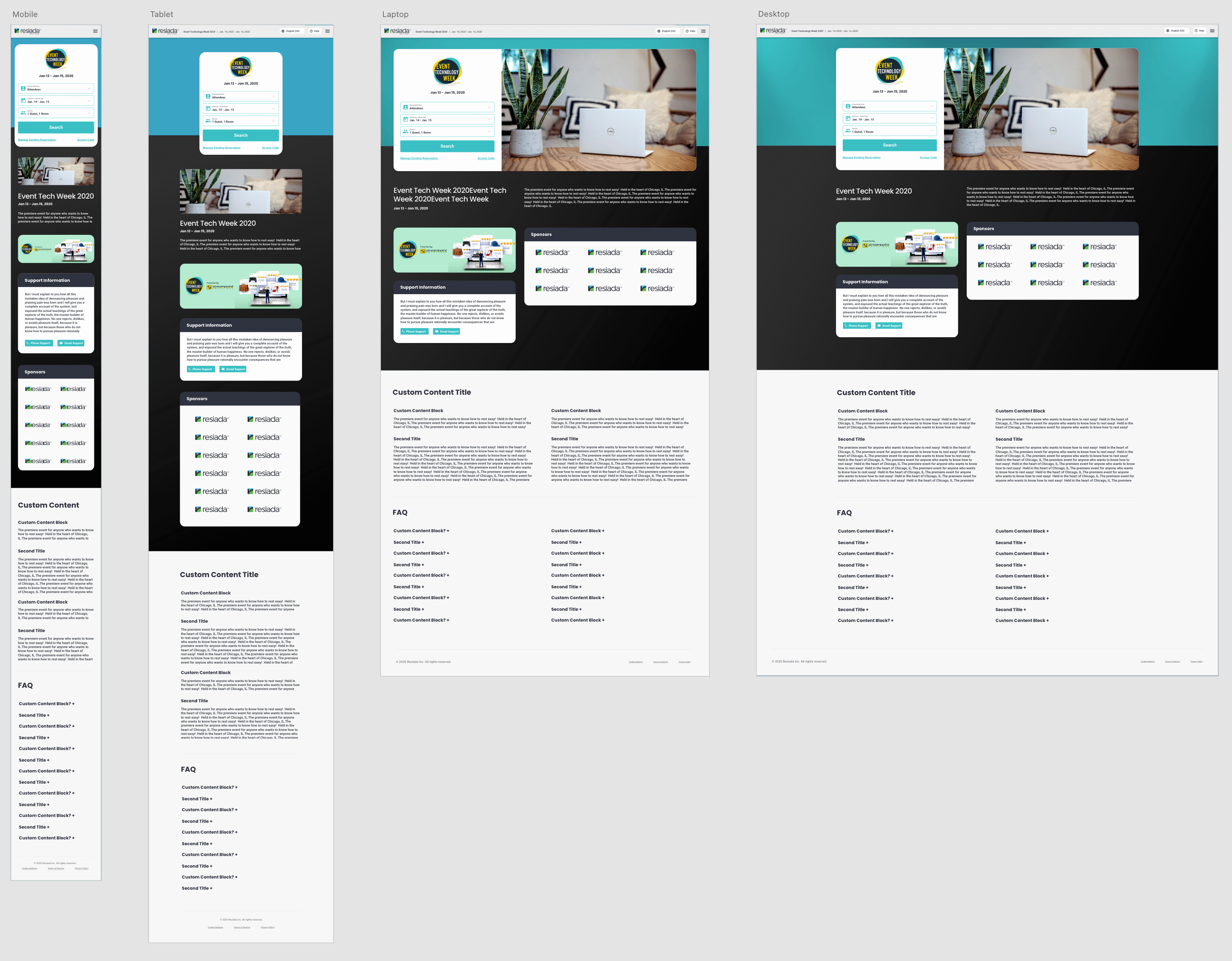
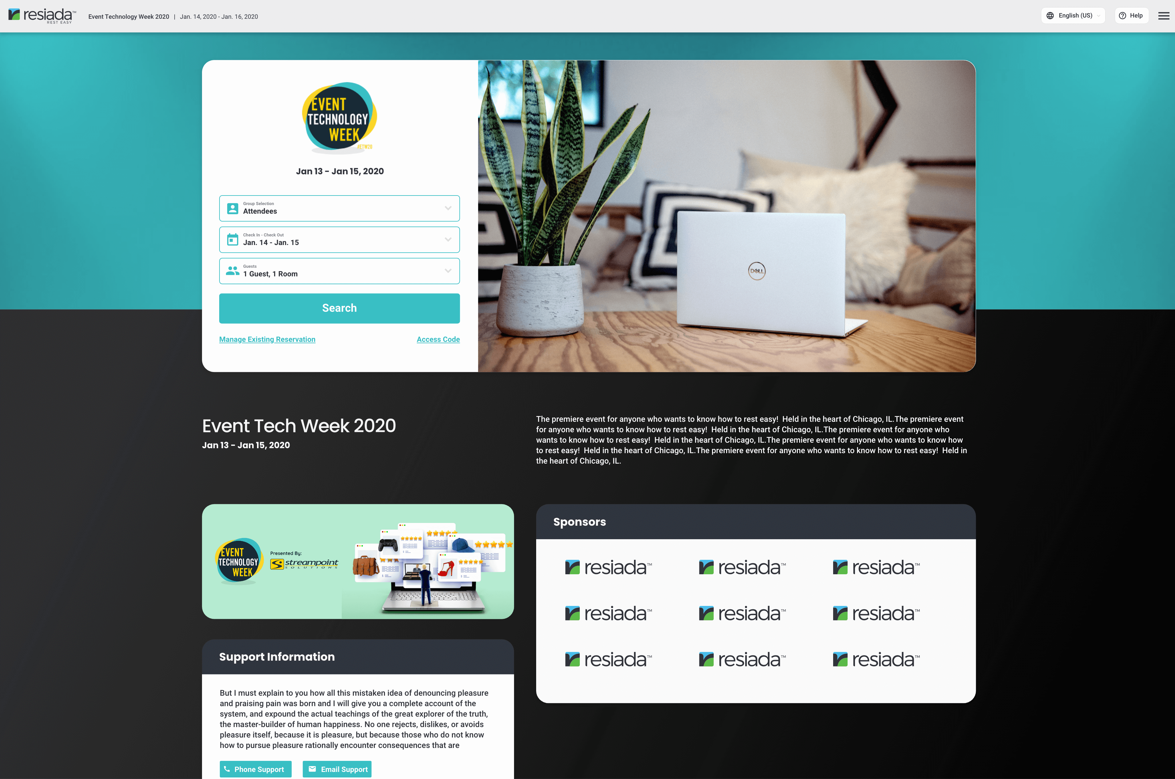
Mobile First
While not specifically shown above and below, we took a mobile first approach to our design. Once we decided on the mobile flow we then went to work on finalizing the larger screens. All screens were mocked up to accomodate phones and an overview is shown.
- 🥇 Award winning!
Soon after launch our platform won a tech battlefield competition and was praised for its ease of use and advanced features. - 📈 Increased Use.
Many clients were waiting for our new features to be implemented, so once released we were able to more than triple our number of clients. - ☎️ Decreased Support Tickets.
Since the updated release of the wizard the number of support tickets have dropped dramatically for event setup, and we expect the same from our revamped booking site. - 📱 Responsive.
While our competition only works on desktops, our platform is fully responsive and works across a wide range of devices. - 👥 Scalable.
I led and performed load testing on our development environment and compiled a report for our development team. After implementing their fixes we were able to go from ~25 simultanious bookings to hundreds using the identical resources. We worked together to optimize the platform to be able to scale more linearly. - 🏎 Speed!
By optimizing our platform and working closely with developers we were able to reduce loading times by 80%. Working closely with the development while I was designing the UX flow was a key part of this. We were to remove any pain points in the early mockup stage. - 🛌 Large or small!
By working closely with all stakeholders I was able to design a system that works for both small and large events. If they’re reserving 1 room or 20 the system is able to elegantly handle all situations. - 🌏 Everyone is welcome!
We were able to successfully update our public site to be fully multilingual, multi-currency, WCAG 2.0 AA, and ADA compliant. By working closely with the developers and keeping up to date on the latest guidelines I was able to ensure a fully compliant platform. I was the lead on WCAG and ADA compliance.